RAZRLAB
Brand Strategy for IoT
The Zeitgeist team is always eager to immerse itself into projects involving progressive technology. What could be more exciting (and challenging) than developing a fresh and cutting edge brand strategy to attract forward thinking market segments that are at the forefront of adopting advancements such as virtual reality, augmented reality and IoT!
Creating a Global Brand Experience
When Dubai based Razrlab reached out to us, they were looking for a global brand experience that rooted back to its three pillars – its top line. The brand primarily needed to capture progressive markets in the G.C.C. and Europe. Razrlab was positioned to dominate the market through lean, cost effective IoT solutions, integrating material design in its process. This presented constraints for the Zeitgeist team, as we needed to deliver a brand and language that adopted the principles of material design in the logo’s visual design and communication strategy.
Communicating Simplified Complexity
We spent days immersed in learning about material design before we proposed a solution. Zeitgeist needed to communicate ‘simplified complexity,’ as the aim of the business was to be the market leader in ‘easy to use’ remote control monitoring solutions in the stationary and portable equipment industry. We used tools to create a collaborative environment that mitigated the pressure of distance, and always looked forward to our virtual meetings with the client. They were a young, driven and technologically savvy team that aligned with our ways of working. This created a seamless process flow throughout the brand’s evolution. Good communication allowed us to deconstruct and clarify the goal, vision and purpose of the brand and business, enabling value addition in the process.
New Brand Identity
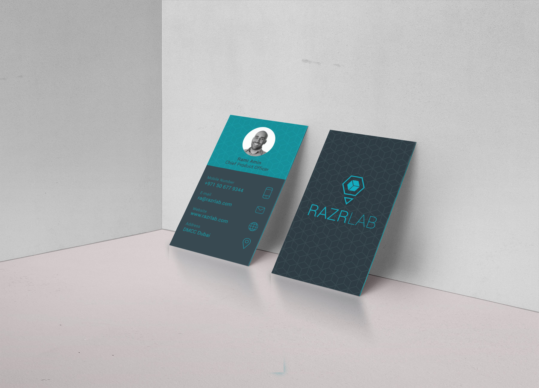
We developed a visual representation of simplified complexity, security and trust. This was emphasised through the forms we used. The hexagon represents stability; the box is representative of the tool box that the business uses internally, while the triangle within the box signifies the the most important part of the business – its 3 pillars. Using colors and line weights that were reflective of material design, Zeitgeist put the brand’s visual identity together, to position it as one of mobility, efficiency and new-age thinking.


