Affettato
Building An Interwoven Experience
Our first restaurant proposal was for for the most delicious pizza in Whitefield and probably all of Bangalore.
This was an interesting project as they were working on expanding from a little pizzeria to multiple locations around Bangalore, this site being their flagship space.
The site was unique. It was located within an abandoned 8000 sq.ft. industrial warehouse that was previously used to manufacture aeronautic parts.
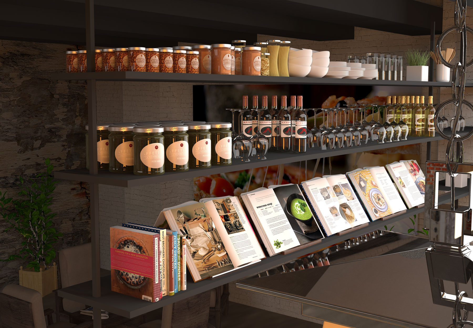
Remaining sensitive to the site context, but ensuring that the delicious pizzas were given their due prominence, we used the framework of design thinking to understand the experience that people wanted in a pizzeria.
From our focus groups we discovered that the expatriate market, which was the targeted segment, wanted a mama’s and papa’s pizzeria, much like you would find on a quaint alley in Naples. Combining that vision with the industrial context of the site, we developed a plan wherein the kitchen wall would be conceptualised as the window to good Italian street food.
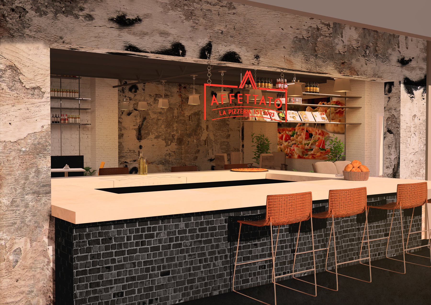
We also proposed a rustic pizza bar as the seamless transition between the indoor and outdoor experiences. We created a large opening to frame and emphasise this interaction, and then worked on extending this into the visual language of the brand.
Extending the Visual Language
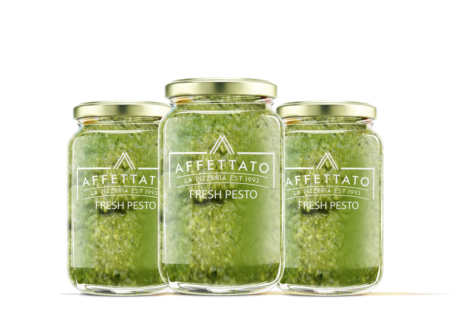
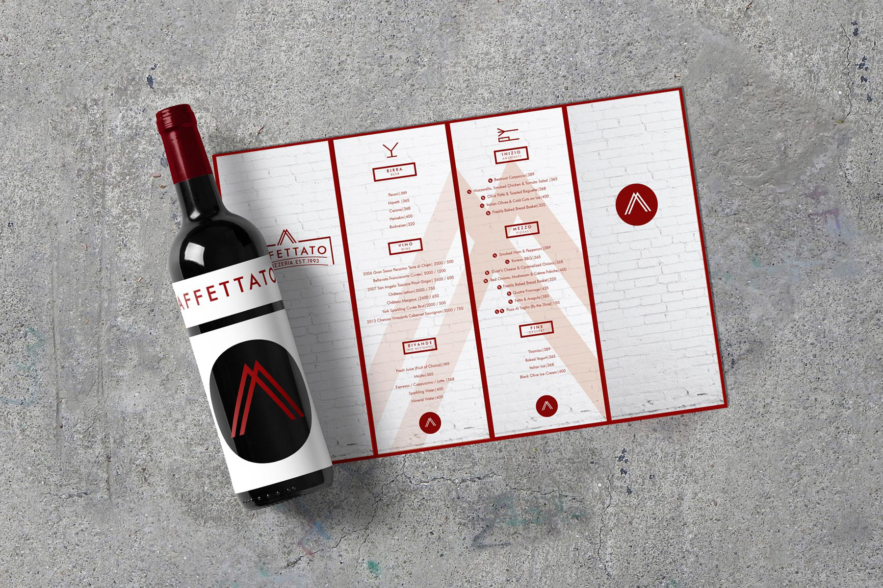
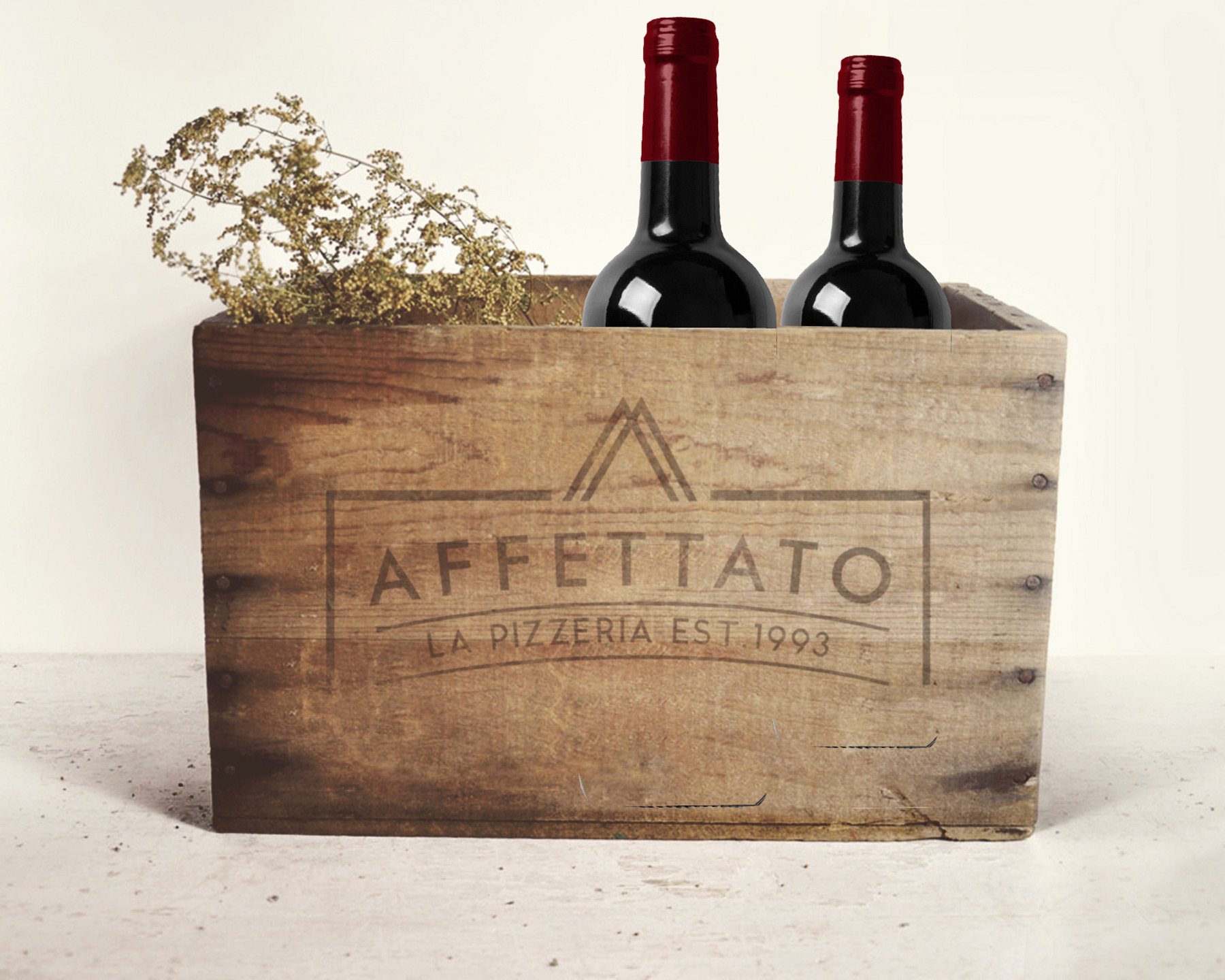
We then drew from the space elements to weave a stronger brand language. The pizza bar’s cutout was introduced into the logo for framing, and we added a triangle to the cap, to represent the ‘slices’ of pizza.
A bold red hue tied the whole logo together for direct positioning of the pizzeria.

