Your address will show here +12 34 56 78
Business Tips & How To's

When it comes to Space Design, be it architecture, interior design or landscape…..dealing with a fussy client who has fixed ideas and isn’t willing to budge, can be the most time consuming and stressful part of the entire project!
But, the customer is ALWAYS king, so it’s best to develop a few techniques for rolling with the punches!


Choose Your Client Wisely

This is difficult, especially when you need the bucks to sustain your business. When you can’t be choosy, know that you have got into something that will be difficult, but remind yourself of the greater purpose. Look at it as a challenge; an eventuality that you will need to confront and overcome to mature. If you have the luxury of choice, it’s simple, choose someone you would enjoy spending the next 4-12 months working with!


Build A Personal Relationship With The Client

Get to know them, spend time with them, let them get to know you, open up to them, share your journey and your tribulations on a personal and a professional front.
Be transparent and prepare the client for the murky road that lies ahead to achieve greatness. Prior to signing the contract, prepare the client for the hurdles that lie ahead, but assure them that you are their lead and will make sure to tie all loose ends and build something beautiful – achieving greatness is never a cakewalk!


Be Confident In Your Recommendations

It’s not easy to sway a fussy client and convince them to choose your way. Remember, you are the Designer. Keep the dialogue open and always assure the client that you will be incorporating their requirements. Listen to what the client wants, but be confident in suggesting what you believe will actually work.


Never Get Defensive With Your Client

This opens up a can of worms – you will go back and forth trying to prove your point, while the client will ALWAYS have their point of view. Clients generally like to have the last word, so best not to indulge in such dialogue; accept the client’s point of view and move on with the project.


Bounce Back Quickly From Unpleasant (but sometimes necessary!) Interactions

If your last communication with your client ended on a sour note, make sure you have a big smile at your next interaction. Be warm and welcoming; greet the client, ask them about their day or the weekend that just went by or talk about something interesting that happened to you before you start talking shop. Dilute the situation as if nothing ever happened and get on with what the client needs you to get done.


Treat Your Clients Like Gold

Finally, never let your client know that you are also dealing with other clients and their grievances. Your clients should feel like they are your number one priority, that their opinions are always right (even if that’s not always the case).

At the end of the day, professionalism, respect, honesty, and truly being able to listen to a client’s needs are what will make or break your business.


Raoul Parekh
Founder & Chief
Design Management


0

Space Design

Making a render photorealistic is every 3D artist’s ultimate goal. In every rendering process good lighting and materials are essential.
Here are 10 simple tips for creating photo realistic renders.


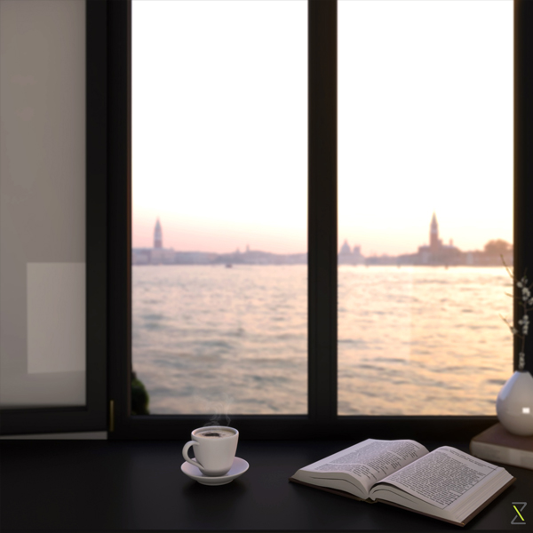
Begin with choosing a scene or inspiration and build the scene with the relevant models. The first step is to define your focal point – focal point means the function of the render – what function are you trying to show? In our example we are trying to show the function of the bay window as a potential reading and coffee drinking space, a time for reflection, respite, or to get lost in thought – so the objective of the render must clearly be defined from a functional standpoint.

Furthermore, you should spend time modelling objects carefully to achieve a realistic form, otherwise you will end up having an object that looks more like a toy.


1. Materials and Maps

Material properties are very important in photorealistic rendering. Playing around with Reflection, Glossiness and Specularity of materials such as metal, wood or glass can make your render very realistic.

Make sure your textures are perfectly mapped and use reflection, bump and specular maps for the respective objects. For example, giving a bump, reflection and adding a specular map will create realistic properties for the wooden objects in your render.


2. Lighting

Always Use a 3-Point Light System – Key light, Fill light and Back light


Key Light – This is the main light. It is usually the strongest and has the most influence on the look of the scene.
Fill Light – This is the secondary light and is placed on the opposite side of the key light. It is used to fill the shadows created by the key.
Back Light – The back light is placed behind the subject and lights it from the rear, rather than providing direct lighting (like the Key and Fill).
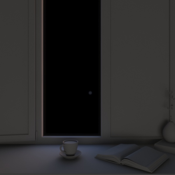
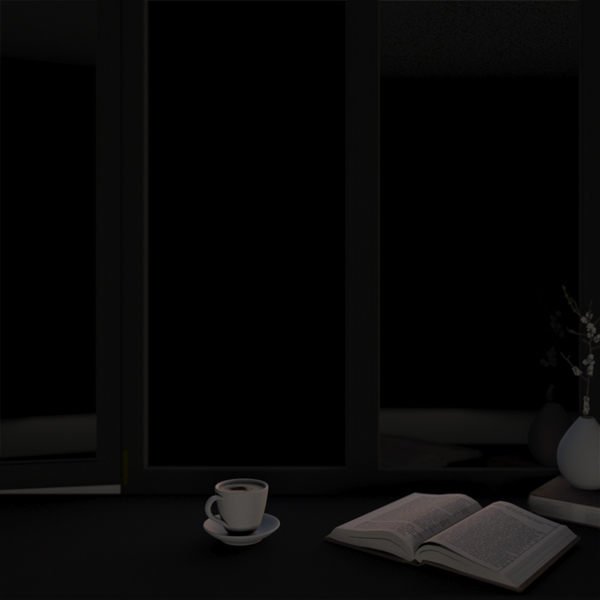
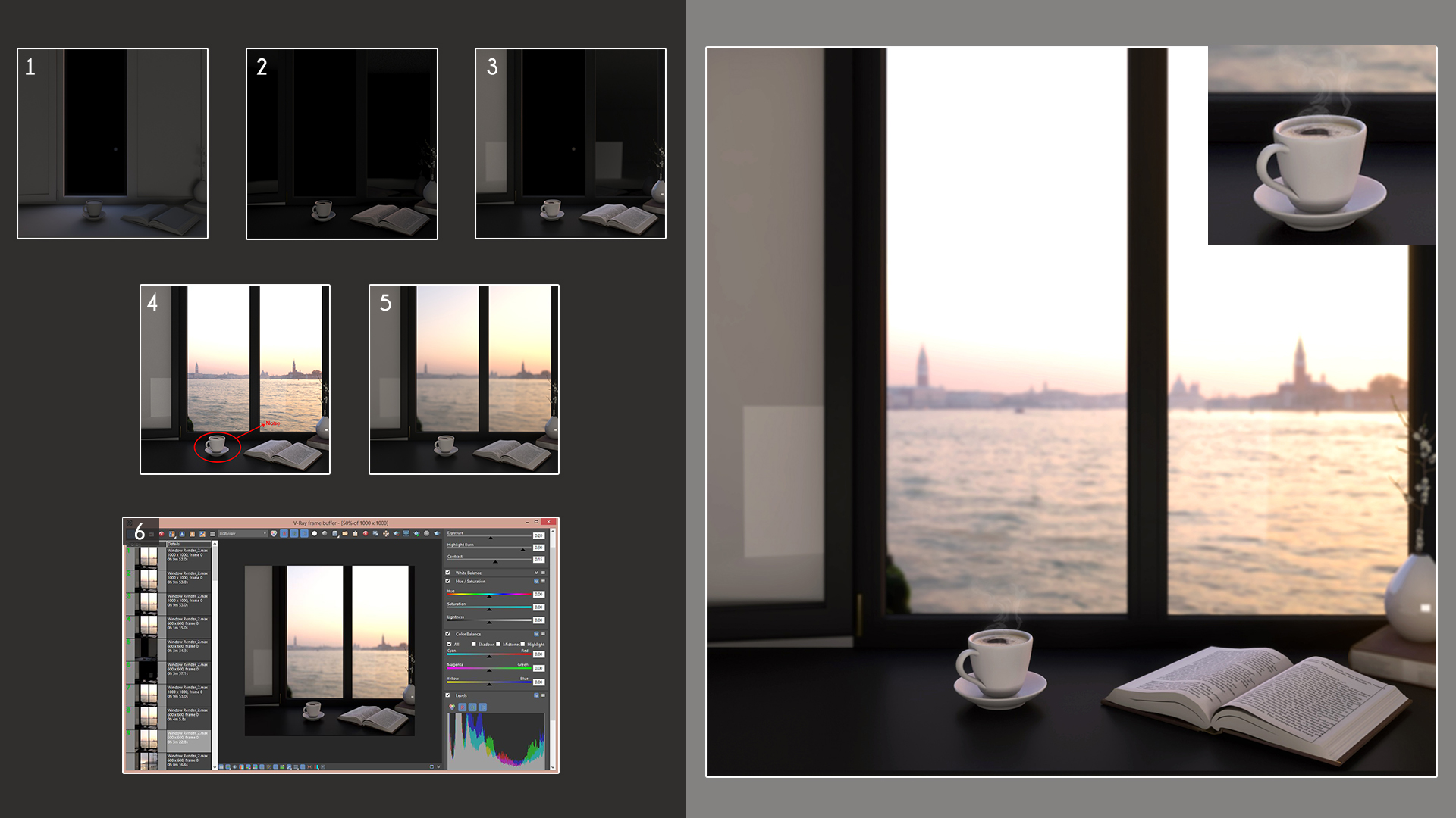
The above image shows only lighting elements activated.


3. Run Test Renderings at Low Quality to Save Time

High quality rendering will slow down your rendering time. So for testing purposes always opt for low quality rendering, until you get the required perfection in your render.

Don’t put all the lights in the scene on at one time; carefully add them one by one, depending on your scene. Set your render engine to a low resolution to give you a snapshot of the final output.


4. Use X-Ref

While working with huge scenes, divide the scene into different areas and save them individually in a different 3ds Max file to work on easily. Then bring them into a single file to render them all together at the end.
Working on X-Ref objects before bringing them into your main scene helps avoid losing render performance when the scene has lots of geometry. This saves a lot of time!


5. Use HDRI Maps


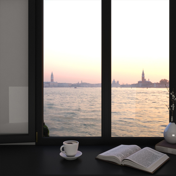
To create a realistic environment I use HDRI maps. This gives realistic material properties like reflection, refraction, specularity and light to your render. Once you select the HDRI map that best suits the scene, use it as your V-Ray environment map along with a V-Ray dome light for best practice.

In the image above, you can see how applying a realistic background, puts the scene in a realistic context by using HDRI maps.


6. Subdivision Value

Realism comes with soft shadows. Use good subdivision values for every light in the scene to create smooth shadows. You can find the subdivision value for lights, materials and GI in the settings. Typically, 32 is the average subdivision value that works best with lighting and global illumination.


7. Use Denoiser


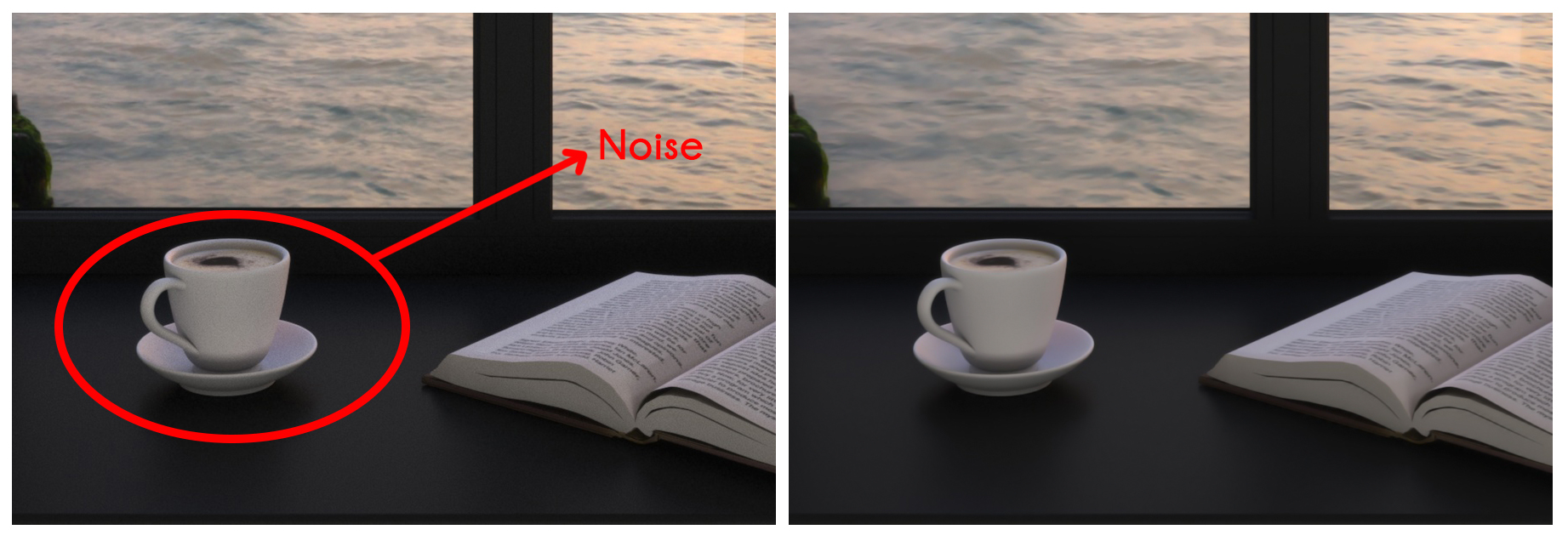
Denoiser can save a lot of rendering time. It reduces the noise in the render and helps smooth light and shadows. It brings realism in the render, because noise makes the render unrealistic.

It is really useful in closed room rendering, because you will find more noise in closed or dark interior rendering. Denoiser is a very powerful tool to reduce noise and creates a clean, smooth shadows in the render.


8. Use Depth of Field


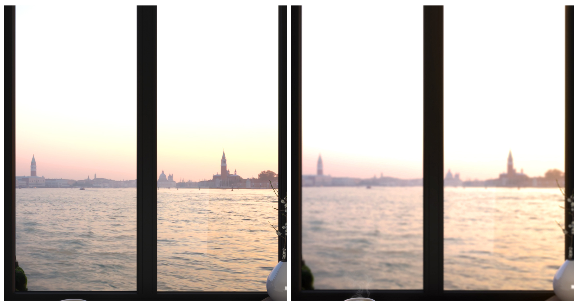
Depth of Field creates a fantastic camera effect. It allows you to create a focal point in your shot, called the Focal Plane. This enables a blurring effect on everything outside the Focal Plane, creating an image that looks photorealistic as seen above.


9. Use Vray Frame Buffer – (VFB)


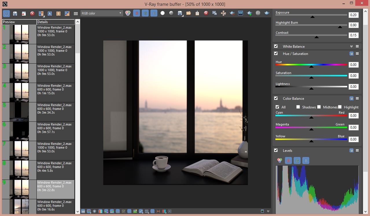
Vray Frame Buffer has very powerful features in it such as Rendering History, Colour Correction and Lense Effect, to name a few.

Rendering History, for instance, allows you to compare the current render with previous render to observe the changes you have made. This would include things like lighting, GI, Camera etc.
Colour Correction allows for small tweaking to enhance the realism in the render.
Lense Effect creates different opportunities to showcase your render.


10. Post-Production in Photoshop


Post-Production is a very powerful tool to change the whole look and feel of the Render. It’s completely up to you to use it within the scene. For example, adding the Motion Blur and Lense Flare effects for dramatic feel, using Blending modes for texture, adding Smoke and Fire etc.

Certain things are either very difficult or very time consuming to pull off in 3Ds max. Adding these effects does them in a jiffy and can go a long way toward bringing an image to life.


Althaf Khan
3D Visualiser


0

Space Design

Architecture is unusual among the arts in that it is required to be professional, and arguably alone among the professions in that it is expected to be in some measure artistic. The careers of all serious architects must at some point grapple with this duality.
To completely abandon the creative spirit is to become simply a builder – performing a valuable service, no doubt, but not creating architecture. On the other hand, when the creative architect renounces the demands of the profession – that the building be on time, on budget, keep the rain out and not fall down – that architect gives up all opportunity to actually practice the art they seek to pursue. So some sort of balance or synthesis between the two poles is necessary; the exact nature of that process can give us a deep insight into the path chosen by a given architect.


STRIKING A BALANCE

For me, the equation has become quite interesting. Certainly my practice must and does fulfil all the professional demands outlined above; but it is the art beyond the skill that continues to draw me further in each project. While my work has stylistically been compared to architects that practice elegant and graceful modernism, such as Mies van der Rohe, Tadao Ando and SANAA, I see myself more in alignment with Le Corbusier. This is not merely because I integrate Corbusier’s “Modulor” proportional system, or even because of my past employment under B.V. Doshi, himself a product of Corbusier’s office and one of the finest modern architects in India, but rather because I see myself in alignment with his way of working – that of balancing the art and the skill. Le Corbusier famously divided his working day in half: in the afternoon, he did architecture, and in the morning, he would paint. While I do not keep to so strict a regimen, I do remain an active painter. This practice helps nurture the creative aspect of my professional skill and I feel that the development of a painter’s instincts gets reflected in my work.


METHOD BEFORE MATTER

The word painterly, in architectural discourse, typically follows from Heinrich Wölfflin’s use, which refers to a swirling Baroque sensibility, in which form is suggested through light and shade rather than through drawn outlines.
But here we are interested, again, not in the content of the work but in the way in which it is produced. The painter is faced with a blank canvas, and then with a single stroke of the brush makes an intervention that transforms the empty field: suddenly there are up and down, inside and out, light and dark. With a second stroke, we now have the field plus two figures in dialogue with each other, and so on.
The painter must proceed from instincts but also evaluate the canvas as it takes shape; know when the elements are correctly balanced (or provocatively imbalanced), and perhaps most importantly, know when to step away and declare the work finished.


Dominic Dubé
Principal, Space


1

Design Strategy

I was sitting in my garden the other day and reflecting on Zeitgeist’s journey as a design house. In effect, we have been agile, design thinking and lean from the very beginning without knowing it or being certified for it back then.


Milestone 1: Designing Spaces that Enhance Human Experiences

The journey began with space design and the desperate desire to inculcate an Indian benchmark to global living standards.
This came from my years growing up abroad and knowing the difference in how I felt in a well designed space versus one that had little or no expression. A space that had intention had the ability to change my mood and mindset. And as we gravitated to applied learning, life pushed us in the direction of designing spaces to bring the best mood out of the human experience. We began to recognise the value in that feeling and held on to it. We had intention. As we moved toward authenticity it became easier to identify the disconnect in an experience – a story half told.


A space that had intention had the ability to change my mood and mindset…As we moved toward authenticity it became easier to identify the disconnect in an experience – a story half told.

Milestone 2: Infusing Personality through Brand Development

It became evidently clear to me that messages were being interrupted and lost when we didn’t put the receiver first and weave language for a complete understanding. The ability to tell that story became the need of the hour. It didn’t make sense to design the environment without understanding how the personality wove through it. We needed to be more than just one of the best interior designers Bangalore had to offer. And so we began to build the other half that was missing. This was not part of the plan. Just a gut instinct and a chance we took. So we tested. Staying light, we brought in the talent for identity design and very soon began to align on projects from multiple perspectives.


Milestone 3: Using Design Thinking to add Value and Impact

When I looked at the plate it still only seemed half full. How could we integrate these services and create an offering that actually meant something in the long run? I wanted more out of the design process. And as I began to search, my search found me. Design Thinking became the framework I gravitated toward. It had the beginnings of a structure that resonated with me. It put people first. Leaning into this kind of thinking aligned with my sense of purpose and growth.


I was excited to put these frameworks into our processes at Zeitgeist.

What would happen if we integrated this kind of thinking into our lean start-up. How much value could we offer? What new ideologies would come out of it? How could we offer strategic design consultancy that added value and impact?

Design thinking….resonated with me…..It put people first.


And so we began to recreate our internal structure around better belief systems, deeper meaning, and higher purpose.
Alignment toward this way of thinking is the naturally progressive way and we fit right in. It amazed me to think how far we had come.

With a gentle smile it struck me that everything happens by design.


Madhuri Rao
Founder & Chief
Design Strategy


1

Space Design
What is Minimalism?

More than a design ‘style’ from a visual point of view, minimalism is a principle – that of removing all unnecessary decor or features from an object and leaving only those that serve the purpose of the object. By doing so, the object is left in its pure form to deliver, without hindrance, that which it was created for in the first place.

To quote Ludwig Mies van der Rohe, “Less is More”.

Whether it be living a minimalist lifestyle or designing an easy-to-use website, minimalism is always about removing what is unnecessary and keeping what is essential. This allows for a clearer focus on what matters most.


What Colours Are Usually Used in Minimalist Interiors?

When it comes to minimalist interior design, a muted colour palette – most commonly black, white and grey – is usually incorporated, to emphasise the clean lines, give the feeling of space and keep the look modern and natural, omitting bright colours that can distract.

Such thinking would be hard pressed to find a spot in India, where we are known for our loud colours, ornate decor and intricate patterns.

But what if there were a middle ground? One that understands that the Indian market is ready to adopt the new and the modern, but perhaps not quite ready to let go of the warmth that we are accustomed to in our homes, and indeed, our way of life.


How Can Minimalist Interior Design Find a Place in India?

Zeitgeist’s design strategy when it comes to finding that sweet spot has been to use a Greige palette while incorporating modern minimalist interior design into various spaces, ranging from hotel lobbies to private homes.

Greige, which is basically a mix of the colours grey and beige, offers in its spectrum a variety of colours that are neutral enough to stay minimalist, yet have the warmth that appeals to the Indian consumer’s sensitivities.

With this strategy textiles and patterns can still be incorporated, as can an array of beautiful natural materials like various natural stones and fabric that India is so well known for.


In this sectional snapshot of a kitchen that was designed by Zeitgeist, we have incorporated clean lines and a greige palette, but have introduced copper fittings and accessories to retain an Indian feel.


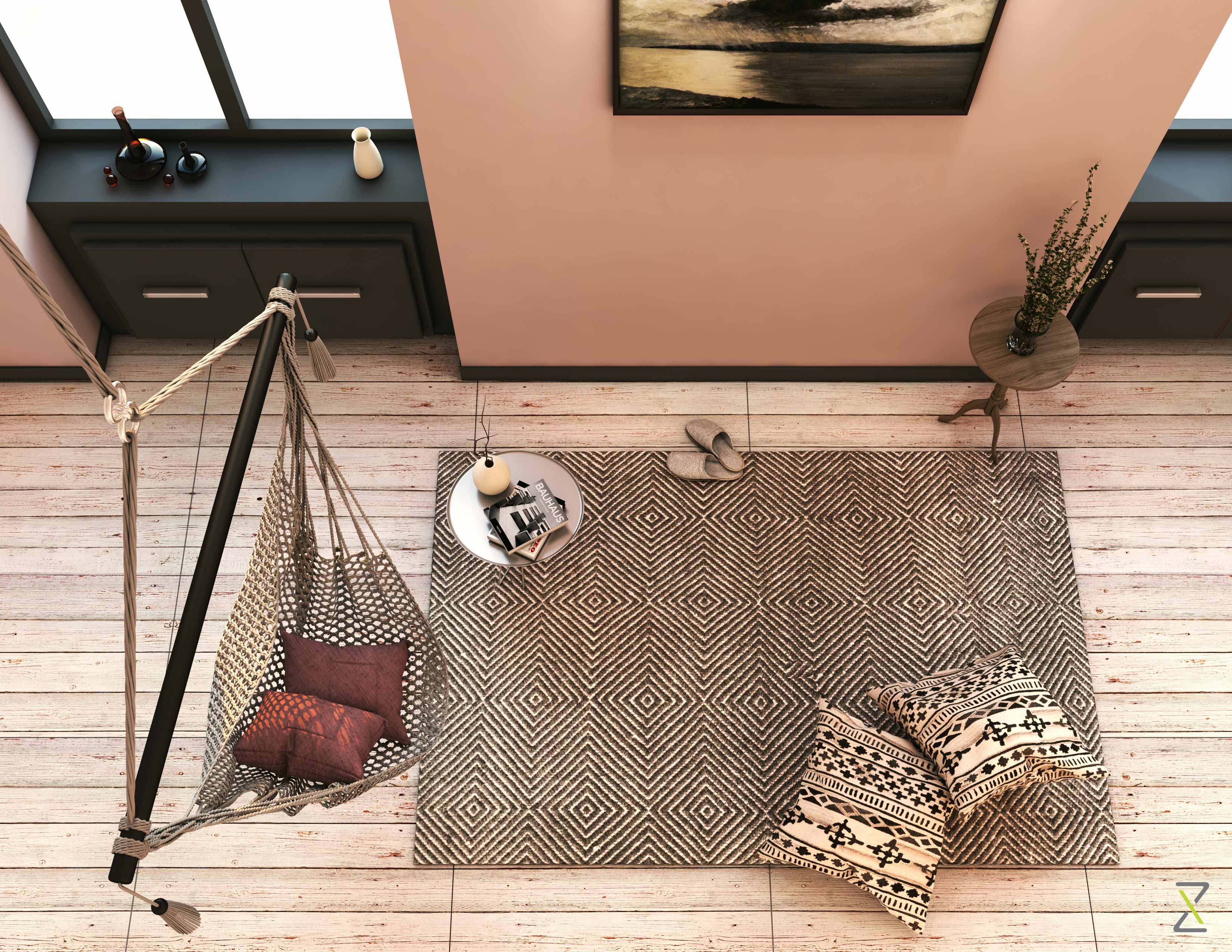
In this laid back minimalist living room, we have incorporated a greige palette into the patterned decor elements and material like jute, keeping the room Indian, yet modern.


0

Design Strategy

Zeitgeist Design and Development is always looking for inspiration from the world around us. From choosing great colour schemes to creating spaces that are both progressive and sustainable, we believe that nature is the greatest teacher of all.

Biomimetics, a field close to the heart of Zeitgeist, enables thought provoking insights into some of the most effective designs on our planet – those that occur in nature.In today’s post we focus on ants and examine how these tiny creatures design remarkably effective systems.

This understanding could find potential application in the fields of:


ARCHITECTURE & ENGINEERING

If you’ve every paused to marvel at how diminutive ants design and construct colonies that are much larger than themselves and capable of housing innumerable residents, here’s something more to be amazed at.Researchers at Georgia Tech University have studied another phenomenon that occurs when fire ants are dropped into water.The ants are able to quickly adapt to the new environment and create a raft like structure that prevents them from drowning. The extraordinary part of this feat is that they use their own bodies as the building material!The ants link up and form a mass that is viscoelastic or able to resist flow under pressure, as well as return to its original form when stretched or compressed.Understanding how they do this could lead to the creation of adaptable, viscoelastic building material, which could be used to construct self-healing structures like bridges and buildings. Such structures would have the ability to auto detect and mend cracks, without human intervention.


DESIGN VERIFICATION & VALIDATION

A product that cannot deliver what it was designed to defeats its purpose.Design verification and validation are key to ensuring that concept meets practicality and is a vital stage between the design and rollout phases of a new product.Ants are known to be experts at finding the shortest routes to food sources, by employing Swarm Intelligence.Research conducted at Virginia Tech, focusing on how ants achieve this, could dramatically reduce the time spent on finding the most optimum solution, as well bring down the costs involved in the design validation process – significant in the age of complex electronics design, where applying traditional methods of verification and validation is becoming increasingly untenable.


ROBOTICS

Ants are able carry heavy loads, often several times their weight. 

Research at the University of Ohio has revealed that the neck joint of the common American field ant is able to withstand pressure of up to 5000 times its body weight! The study of this astonishing capability could find application in the field of robotics, enhancing the potential of what could be done on earth and in space.


DESIGN OF ORGANISATIONS, COMMUNITIES & LOGISTICS SYSTEMS

The structure of any colonies has much to teach us about effective organisation and logistics design.

  • The division of labour in ant nests, which determines its structure and habits, is according to age and size. The effectiveness comes from each creature contributing what it is best at, while collectively choosing co-operation over competition.

  • Adaptability is key, with labour patterns and worker distribution altering as the colony grows and develops. Scaling up is thus more of a natural progression and less of an ad hoc activity.

  • The basic design of ant colonies, which uses vertical passageways for movement and transport, and horizontal compartments for work, storage and housing, sheds light on effective operations and logistics.


These are just a few design ideas that we can employ from the world of ants, which also teaches us to pause and realise that:


  • Sustainable solutions can be reached through adaptability to the environment rather than the exploitation of it.

  • Synergy can be achieved even amongst the tiniest of creatures, as long as they are working together for a common cause.

  • Utilising and enhancing the inherently unique features of a system can bring about ingenious solutions to large-scale problems.


At the core of Biomimicry is a respect for nature and the acknowledgement that we could potentially learn a better way from it… even from a seemingly insignificant little ant.​


0

NO OLD POSTSPage 2 of 2NEXT POSTS