Your address will show here +12 34 56 78
Brand Strategy

Ferrari was just ranked as the world’s strongest brand (not to be confused with the world’s most valuable brand, which is Amazon) in Brand Finance’s annual report on the world’s most valuable brands.

While several factors make up a strong brand, today we’ll focus on one element – the role a brand promise plays in building a strong brand. A brand promise has been defined in various ways, but in essence it is what a brand commits to deliver, every single time, via every interaction with the brand.

So which brands have got it right? Let’s take a look at 3 examples:


FERRARI

Ferrari has always been clear about why they do what they do. Their mission states “We build cars, symbols of Italian excellence the world over, and we do so to win on both road and track. Unique creations that fuel the Prancing Horse legend and generate a “World of Dreams and Emotions.”


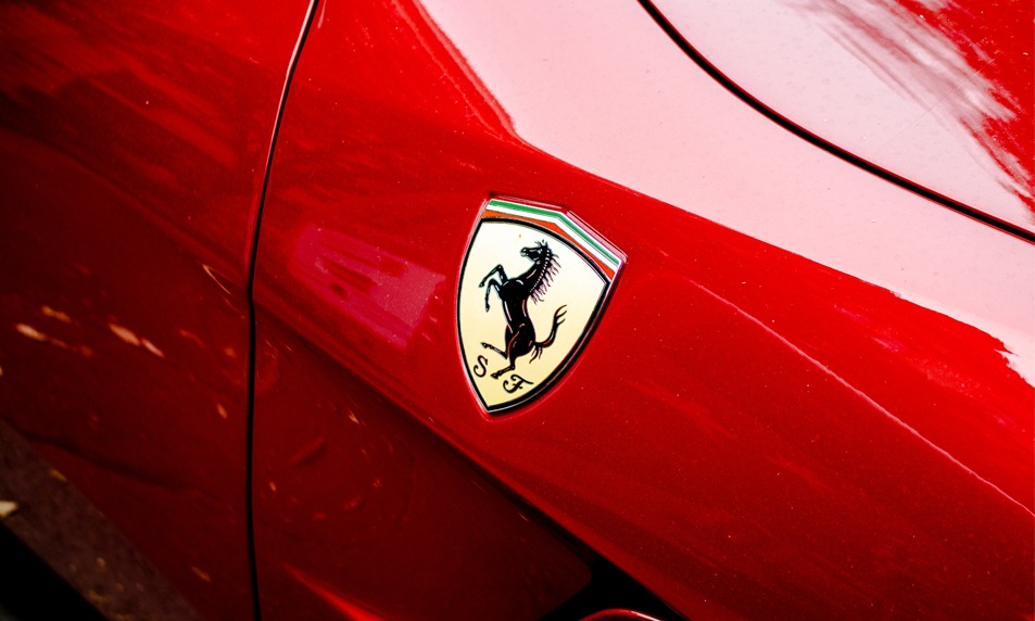
The clarity they have on why the company exists, is translated into all that they do, be it developing the latest technology to win in Formula One racing, incorporating the sleekest designs and ultimate driving pleasure into their customised on-road cars or ensuring an unparalleled exhilarating experience when one visits the Ferrari Museum at Maranello.

With every brand interaction the customer experiences uncompromised excellence. It is the reason millions of motorsports enthusiasts who will never drive a Ferrari feel emotionally connected to the brand.


NIKE

Nike’s mission is “bringing inspiration and innovation to every athlete in the world” with the annotation “if you have a body, you’re an athlete”

Nike’s messaging through its ad campaigns has always focused on attitude, rather than a person’s ability or achievements. Most of their ads feature ordinary people, who are fuelled by a passion to ‘Just Do It’; the message is to overcome laziness and obstacles and reach for the stars.

The two ads below, one from 1988 and one from 2017 are excellent examples of how the company has stayed true to its brand promise over the years:


NIKE advertisement, 1988


NIKE advertisement, 2017


Nike stays true to its brand promise (bringing inspiration and innovation) through its messaging, as well as through the innovative technology it incorporates into its products and experiences associated with them. Whether it’s the recently launched Nike Adapt BB , its Flyleather technology or the company’s first Nike House of Innovation at Shanghai , the company continuously delivers cutting edge innovation.


COCA COLA

How is it that a carbonated drink that contains undesirable amounts of sugar ranks amongst the world’s 10 strongest brands? It is in huge part because of consistent brand messaging that ties back to a clear brand promise. Coke’s brand promise, “To inspire moments of optimism and uplift”, is all about bringing family and friends together, sharing and happiness.

The company has shifted the focus away from the product itself and moved it to the brand, staying consistent in its messaging over the years. 1971 saw the iconic ‘I’d Like To Buy The World A Coke’ ad, which featured a cast from over 20 countries and portrayed the drink as “not only a refresher but a way to connect with people you love, people that have the same taste for Coca-Cola.” It also touched upon diversity.


Read about the interesting story behind this ad campaign here


Nearly 50 years later, the Share a Coke campaign sticks to the same brand promise, but has moved with the times and is more relevant to today’s youth, the brand’s main target market.


KEY TAKEAWAYS

1. Simply defining a brand promise isn’t enough. A brand must be able to deliver on that promise – every single time. Companies that fail to do so run the risk of there being a misalignment between the user’s expectations and what they actually get, eventually leading to the weakening of the brand.

2. A brand promise should serve as a guiding star for everyone working in an organisation, helping them to understand their role in achieving a bigger purpose.

3. A brand promise, whether explicitly stated or subtly incorporated into a company’s products, services and interactions, gives the customer clarity on what to expect from a company and what makes that company different from other players. It is the reason McDonald’s – a fast food chain considered unhealthy by many – has a market in Paris, one of the best ‘food cities’ in the world! It may not be the healthiest food, it may not be the ‘tastiest’ food, but you know exactly what to expect from the brand in any of their outlets in any part of the world. The brand promise is consistently delivered through every interaction, building customer loyalty. It is the reason McDonald’s ranks No. 5 on Brand Finance’s Top 10 Strongest Brands of 2019.


Does your brand have a brand promise? Zeitgeist can help you discover it. Reach out to us for help with your Brand Strategy.


0

Brand Strategy

A few weeks ago, we featured an article that highlighted 3 excellent examples of brands that had been redesigned for enhanced impact.


In the same vein, today we’d like to share a branding project that Zeitgeist recently worked on that is also aimed at enhanced social impact.


As an entry for the How International Design Awards, Zeitgeist extended its work on a brand awareness campaign entitled “The Invisible Blue”, which was developed in collaboration with Parinaam Foundation, a Bangalore based non-profit organisation that cares for “the needs of urban and semi-urban economically underprivileged women.”


One of the programmes that Parinaam runs is the Academic Adoption Programme (AAP), whose aim is to “transform the lives of desperately poor children by providing them access to high quality education in the English medium through academic scholarships.” This is facilitated through sponsorship from patrons, and is the only way, Parinaam believes, the vicious cycle of generational poverty can sustainably be broken.


The Invisible Blue campaign was created to draw focus to the vast segments of our population that go unnoticed and uncared for in our urban context – the bulk of them live in slums and shanty towns, most recognisable by the extensive use of blue tarpaulin, a makeshift protection against the vagaries of nature.


For the HOW competition, which was framed around the idea that “Design speaks to each of us in a universal language. No matter your native tongue, excellence in design can intrigue, inspire and stir one’s emotion”, Zeitgeist designed 3 posters, each anchoring down to a separate hashtag developed as evocative and progressive calls to action. The target audience for this particular campaign was working professionals.


1. #canyouseeme


This hashtag and poster were developed to create awareness.


It features a white-collar professional, against the backdrop of corporate India, juxtaposed with an inverted, muted reflection of an underprivileged young boy against the backdrop of a slum.


The Premise:

How often do professionals, sitting in their high rise offices notice or think about those that were not as fortunate as themselves to receive a good education? What would the less fortunate achieve, were they given an opportunity? In many of our urban cities, such offices exist in proximity to such slums, but the question is – #canyouseeme


2. #canyoufreeme


This hashtag and poster were developed to elicit empathy.


It attempts to take the viewpoint of an underprivileged, uneducated child, looking out from inside his home – a shabby blue tent, onto urban, corporate India.


The Premise:

Does education not free us all in a way, by opening up new opportunities and new possibilities? Underprivileged children do not get these same opportunities and are thus denied the possibility of freeing themselves from the vicious cycle of generational poverty. By asking the question #canyoufreeme, it suggests that the viewer has the ability and the power to do something about the gross inequality a helpless child has been unwittingly and unfairly subjected to.


3. #canyouteachme


This hashtag and poster were developed to prompt action.


It features a curious young boy peeping out of a notebook, that could so easily be his blue tarpaulin tent – the choice is really up to the viewer.


The Premise:

Often people don’t realise that they can do something about a prevailing social problem. The question #canyouteachme nudges the viewer towards the realisation that he/she actually can do something about this particular social problem, via the initiative provided by Parinaam, and most importantly, at a cost that would not make much of a difference to the lifestyle of the majority of corporate India.


The campaign creates bridges of awareness, compassion and purpose between privileged India and urban underprivileged Indian children – the future of our country, who deserve an equal chance at education, empowerment and a better India.


0

Brand Strategy

The goal of Design Thinking is to develop solutions that create value within a given context.

As science advances, perceptions change and progress takes place, the requirement of the end user changes as well.

Isn’t it pertinent then to regularly re-evaluate the relevance of an existing design in its current context? Especially if it is one that has been around for a while?

This is what ignites the flame of innovation. Here are three examples of re-branding done intelligently and that spark a deep connect with their respective audiences.


Towards Inclusivity – The International Symbol for Access (ISA)

As the ISA – a white figure in a wheelchair against a blue background – celebrates its 50th anniversary this year, McCann London has launched its Visibility93 campaign to address the sign’s relevance in today’s context.

Over the past 50 years, advances in science and people’s perceptions have led to us as a society slowly recognising that a person in a wheelchair is not necessarily indicative of someone with a disability. From physical disabilities like arthritis to mental ones such as schizophrenia, ‘invisible’ disabilities can often be overlooked and suitable access denied. The Visibility93 campaign was launched by McCann to shed light on this and to reimagine the sign as one that is more inclusive.


The Visability93 campaign includes a suite of custom typeface that can be freely downloaded from the campaign website, as can a free poster, to raise awareness of the same.

Why the number 93? According to Sport England, 93% of the people living with disabilities do not in fact use a wheelchair. McCann wanted to draw focus to this eye-opening statistic.


The original disability sign, designed by Danish student Susanne Koefoed in 1968 played a huge role in raising awareness and promoting empathy, acceptance and a change in perception. But even the best of designs must take heed of the zeitgeist and readapt itself to become meaningful and relevant in its current context.


Making Growth Fun – Social Mobility Foundation

The Social Mobility Foundation in England, is a charity that works towards improving the lives of young people from low income and minority sections of society, by helping them gain an entry into good universities and on to the career paths of their choice.

Jones Knowles Ritchie (JKR), which worked on the project for free, has rebranded the organisation to be more in tune with the target audience – a young, Internet savvy, always-online community. The new identity is playful and inclusive.

Keeping in mind that online platforms are a big marketing channel for the organisation, JKR developed animated branding, which you can see below – it’s playful, attractive, clever and representative of upward mobility. The missing ‘o’ concept was extended to promotional and marketing material.


The firm was also cleverly able to transfer the missing ‘o’ concept into static print material, such as posters, brochures and t-shirts.


While developing the redesign, JKR worked within certain constraints. For example, it didn’t alter the existing identity to an extent that it would no longer be recognisable as that of the organisation’s. It made subtle tweaks instead, such as retaining the original colour palette of pink, purple and white, but opting for slightly brighter shades. It also kept in mind that running costs across brand extensions should be kept to a minimum to make it a viable proposition for the charity. So a free typeface that is readily available on Apple and Microsoft systems was chosen, while existing photographs from the charity’s own vast database were used for impactful imagery.


Depicting the Role of Women in 2018 – Girl Guides, UK

The role of women in today’s society is vastly different from what it was a 109 years ago, when the concept of Girlguiding was born. For over 100 years, the organisation has been encouraging girls and women between the ages of 15 to 25 to “learn new skills, work as part of a team or as a leader, and complete projects for social or charitable causes.” The Guides are split into 4 categories based on age (plus the Senior section for those aged 14 to 25). Guides can earn accomplishment badges in a skill or an area of interest by completing certain (age appropriate) challenges. The brand’s redesign which was developed by Red Studio, focused on a new look and feel for the badges and the corresponding award books and handbooks. It also incorporates the addition of new skills to the Guides’ repertoire, such as Coding, Inventing, Human Rights and Festival Go-ing.


The badges are current, appealing and appropriate to all the Guide age groups. One of the main outcomes of this re-design is that the new badges have a more “permanent” feel to them – they can be sewn onto jackets, caps, blankets etc. as keepsakes, evoking the feelings of achievement and belonging, as well as nostalgia in the years to come.

While the colour palette for for all the age groups is the same, the books for the two younger groups focus more on the colours and contain illustrations; the use of colour in the books for the two older groups is more pared down and photographs instead of illustrations are used.


The examples highlighted here have added value to existing designs by making them relevant to their current audience, in their current context, without taking away from the core of what each brand has stood for over many years.


Design Thinking focuses on human-centered design that truly adds value to the end user. Do you have a brand identity that needs re-imagining for today’s world? Using the framework of Design Thinking, Zeitgeist can help you design and develop a Brand Strategy that can take your business to the next level. Reach out today!


Gitanjali Singh Cherian
Marketing Manager

Image and information source: www.designweek.co.uk


0

Brand Strategy, Design Strategy

Human beings are built on connections. Think about how many connections the human body alone has!. And then think about how human beings cannot survive alone. We are built on methods of communication – within and without; millions and millions of them. And without them we wouldn’t be able to process anything.

Now think about food. What does it really take for us to wholly enjoy the process of eating food? Once again, millions of connections. But where do these connections start?

For us it began with Sanctuary Architects reaching out to us to collaborate on developing the Brand for a restaurant they were designing for a top notch Client. This came to us as a pleasant surprise. Weaving brands and spaces was home to Zeitgeist, but now we had the opportunity to showcase our talent alongside Anshul Chodha, principal at Sanctuary – and this was more than appetizing!

Digestion is the process of breaking down food for the body to use as nourishment – this is not far removed from the process of collaboration, for healthy design.


THE EYES – The Visual Appetizer

Have you ever heard of the saying ‘we eat with our eyes’? Perhaps you are starving, perhaps you’re not; but your eyes are the first impulse driver for you to want to devour good food. For a designer, the same can be said of well crafted design.

On a massive floor plate sitting atop one of Bangalore’s most prestigious buildings, Anshul’s design direction for the restaurant was reflective of the expansive cityscape that lay ahead. Magically lit gabion walls exuded strength in connection, and his well conceived travelling walls spoke of a global Pan-Asian story. Though it is usually the other way around, the space lay the foundation for Zeitgeist to visualize the brand at break-neck speed. It set the direction for the Brand’s name and visual identity. It also helped us immensely as we created photorealistic renders as imagery for the final output for the space. There was so much to absorb, just with our eyes.


THE MOUTH – The Provocative Main

Did you know that way before food even enters your mouth, its aromas create a saliva producing reaction to enable the breaking down of it upon entry? The chewing then takes care of the rest. This too is the tale of powerful design collaboration before market entry. Just like the body’s preemptive intelligence to break down food, design intelligence comes from multiple communication exercises and touchpoints through the design process, before its final output.

As Sanctuary began to weave design language to invite the market into a powerful spatial experience, Zeitgeist worked toward expressing the brand to reflect the importance of it. What were the languages, expressions and words we could use to express the combination of this luxurious business and its spectacular design direction?

Multiple conversations with the Client brought us to the point where we understood that the brand name needed to be simple enough to pronounce in a multicultural context, without losing its positioning in the market. As we ingested more and more information about the Client and the collaborative process that lay before us we began to lay out structured steps to arrive at an integrated solution for the Client and our Design Collaborators.


THE STOMACH – The Sweet Satiation

The stomach does two things:
1. It acts as a holding station for food
2. It also facilitates the breakdown of food for the body to absorb nutrients

In the same way, Sanctuary created a holding station for the Client and we drove the nutritional breakdown of its offerings. The interiors express urban Pan-Asian luxury through its use of materials and large expansive openings. The interesting and carefully designed seating nudges a sense of grandeur, while the well defined spaces offer privacy based on mood and function. The brand’s design and development aimed to tie the interior expression into the Client’s vision for the business – an upmarket, luxury pan-asian restaurant. Together with the Client, Zeitgeist decided on the name Kaze – meaning ‘wind’ in Japanese – and developed its visual identity with airbrushed swirls of purple and gold to evoke the feeling of royalty, gently moving in the breeze. The menus were adapted along the same color palette, with added graphics to distinguish the bar menu from the food menu, and content was reorganized to enhance user-friendliness.


Just like the body processes food, together we imagined an experience that would be enjoyable to digest – one built on cohesion, collaboration and connection.


Madhuri Rao
Founder & Chief – Design Strategy


0

Brand Strategy

Here’s a new word people are warming up to in the graphic design industry – Stylescapes – and this blog is going to talk about how they are used as part of our branding process at Zeitgeist.


Clients often don’t know how to respond when attacked with a board full of pictures and random alphabets, aka Moodboards; mostly because they’re not sure how to read or interpret them. But it is still crucial to go through this step because it lays the foundation stone for the logo.


Enter saviour: Stylescapes!


These are just nuanced, more ‘finished’ versions of the above. It makes it much easier for the client to visualise and choose the future of their brand and saves a lot of avoidable back and forth time.


This step provides a good check-in point for both parties to agree on two things:

1. If the designers have clearly understood the client’s description of their concept.

2. The design direction the client is choosing to head with.


Decoding The Board

Stylescapes are made huge in size to scale up the ‘real-feel’ of the brand.


They list out the brand promise, the brand pillars, typeface and fonts, the colour palette. They also contain sample photographs of different users of the product/service. Elements of brand language such as textures, grids, photography style, illustration style, web and print mockups etc. Depending on their process, some designers also choose to put in initial logo iterations as well.


The key to choosing the right design direction is by picking a stylescape that hits the ‘feel’ of your brand just right. That being said, remember, the elements on the board are always up for play and further refinement.

It is far more efficient to tweak a stylescape in the right direction than redo a logo headed in the wrong direction!


Here is an example to understand what a styleboard looks like and how a design brief can be given different visual takes. Different typography, colours, photographs and adjectives have been used here to create 3 separate brand identities ranging from conservative to bold.


‘Cue’ is a brand designed by Blind with Hudson Pacific Properties.


0

Brand Strategy, Business Tips & How To's

If your company were a human being, its brand is the element that would be most reflective of its soul.


It is this ‘soul’ that presents your company with the opportunity to stand apart from the rest. It is this ‘soul’ that forms the basis of all that your company stands for and wishes to portray to its customers. It must shine through.


Executing this is not a simple task and often the best way to go about it is to hire an expert in the field – a brand consultant – to help you develop the identity of your company and then communicate it.


But how do you choose a brand consultant? How do you find one that is a good fit for your particular company? This article gives you some points to consider.


Background and Ways of Working

Do some research to determine the background of the consultants you are considering. What are the kinds of brands they have worked with in the past? Do you feel that those brands represent similar values and design aesthetic as your own? What can you learn about their ways of working? Do they seem flexible or does it appear that they are driving a core design intent across all the brands they service? Do each of the brands they service stand apart in their own right? Reviewing a few of the brands they have already worked with will help you to quickly determine this.

What are the processes they employ to help you with your brand’s development? A visit to their website is likely to provide you with those details. Check to see if important practices like brand development workshops, where the client is invited to participate in a transparent process, a brand audit and industry R & D form a part of their ways of working.


Your Brand’s Requirements

Are you a startup? Or are you at the stage where you’re looking at expanding your brand globally? Perhaps you’re considering rebranding after your company has been in existence for a few years. Your brand’s requirements should also play in role in choosing a consultant. For example, a boutique firm might be able to offer you niche services either in terms of expertise or geography, while a global MNC would be better to help with the development of your brand at a global level. Does the agency offer a brand audit so that you can jointly make an accurate assessment of where the brand is positioned today, before determining the direction it needs to go in?


Reputation

Most brand consultancies were started by people who have come to be known for some aspect. What’s the agency you’re considering best known for? Is it their networking ability? Their expertise in one particular industry? Do they mostly work with the branding of consumer goods or B2B clients? Such questions can help narrow down your options. What are their existing clients saying about their services? A good place to start your research would be social media sites, especially LinkedIn, Facebook and Twitter and Google Business listing, where clients’ ratings and comments would be available. Of course, there is nothing like having a chat with a client who has already worked with them.


Stage of Brand Development

If you’re looking at developing a new brand strategy or revamping an old one, perhaps looking at going with one of the big guns of the industry may make sense as a one time investment for strategy.


On the other hand, if your strategy is in place and it’s execution you’re looking for, which you can drive yourself, choosing an upcoming firm with a good reputation may make more economic sense. In either case, do make sure you meet the people you will actually be working with, not just a representative of the firm.


In a nutshell, choosing a brand consultant really boils down to matching what your brand’s particular requirements at this stage in its life cycle are with what the various firms can best offer you.


Branding services form a part of Zeitgeist’s holistic approach to designing and managing innovative ideas from inception to execution. You can see some of our work, including brands we have worked with, here.


Gitanjali Singh Cherian
Marketing Manager


0

Brand Strategy

A brand is not just its logo. It is an identity; a personality. A ‘brand’ is what makes a consumer your customer. It is an experience that needs to be designed. But how does a design agency take it all the way there?


Imagine a really complex game of Pictionary mixed with Taboo… I think that would be a good way to describe the process that takes place between a designer and a client while developing a brand.


START AT THE BEGINNING

One of the first things designers need to do while developing a brand is to understand their client’s vision – by asking questions.


How well a designer is able to assimilate their client’s vision lies in their ability to ask well-crafted questions and to be a good listener.


With reference to the comparison drawn before, a client meeting could sometimes be that part of the game where all the right words you want them to say are taboo. The only way you can guess is by drawing them out for your client and the only way they can respond is with more non-taboo words!


That can get irksome.


So, here are some ideas on how to ask questions while developing a brand’s identity. The Internet of course is everyone’s resource-base, but this article will help you make those questions smarter and more tactful. 


TIPS ON FRAMING THE RIGHT QUESTIONS

1. Human beings are storytelling creatures. We are drawn to memorable personal narratives, which always makes it a good idea to start with your client’s story. How was their business born? What motivated or inspired them?


This will give you a real insight into their earnestness for their project. It will also open your client’s heart to trusting your process and sharing with you uninhibitedly, throughout.


2. Not every client may have exemplary imaginativeness; therefore it is up to your questionnaire to give them the platform to communicate their thoughts effectively.

Situation questions are the most fun, brilliant way of doing this. Here are some question examples:

   –  Do your customers belong to certain a age/demographic?

   –  How would you describe these people?

   –  Where are they consuming your product?

   –  SIf you were to overhear someone describe your brand to another person, what do you imagine they’d be saying?

   –  In what setting did you picture these two people talking?

   –  What words do you never want associated with your brand?

   –  Situation questions are the most fun, brilliant way of doing this. Here are some question examples:

   –  If you had to choose an actor/actress to play the character of your brand, who would it be? Why?

   –  Imagine your brand were a period in time; what would it be and why?


3. Questionnaires can sometimes sound like exams that incite a feeling to answer ‘correctly’— and that’s not very useful. This typically happens in a casual conversation: ‘But don’t you think…’ or ‘You want it to look… right?’ To reiterate, asking leading questions is a bad idea.


4. But on the other hand, do keep in mind the subtle difference between leading and clarifying questions. The latter is a good practice when reinforcing important points spoken about earlier. So make sure you establish the intent of your asking.


5. While it is valuable to ask for preferences in colour or motifs and such, make sure to ask your client to not get too fixated on them. Since the actual making of the logo happens much later in the process, a designer wouldn’t want to feel restrained by things like colours.


6. Be conscious of what you assume. If your client owns a business for progressive farming techniques, they may or may not want to use the colour green or have a leaf in their logo. It’s good practice to always crosscheck.


7. It is important to know when it’s pertinent to use either an open-ended or a close-ended question. Here’s a personal example: I’d asked, ‘Do you have any thoughts for your company tagline?’ and all I got was a flat ‘No’. It might have been more helpful for me to have put it this way: ‘What feelings would you like your company tagline to provoke in a customer?’ and then followed by ‘Do you have any existing ideas for one?’


8. A section of the questionnaire should just be devoted to juicing out adjectives and as many descriptive phrases as possible. Sitting together and jotting down an expansive pool of words that can be ascribed to the brand is a remarkable exercise for getting those creative juices flowing!


9. One might not always feel the same passion they felt when they were first struck with their idea. Hence, asking your client to answer your questionnaire in a certain setting can be a great way to bring that feeling of passion back to them!

You could suggest an isolated cubicle in their busy office or answering it right after they’ve come back from a vegetable store (for example, if their business is about organic greens).

To make things more stimulating, you could conduct your interview in the place where the client first came up with their idea or any environment where they feel most zealous about their brainchild.


10. Finally, leave scope for things you might not have been able to predict you wanted: ‘Is there anything else that came to your mind while answering this questionnaire?’ is a great way to end.


Remember, the right answer might just be the right question away!


Pahi Gangwar
Graphic Designer


0

Brand Strategy

In the same way placing a Ferrari logo on an old, beat up car doesn’t make the car a Ferrari, branding is much more than just designing a brand’s logo or developing it’s name. Here’s what a sound brand strategy can do for your business:


1. CREATE A LEADER – Brand Consultancy


Brand Consultancy addresses the value your brand has to offer to the market.


Developing a sound strategy begins with a brand development workshop. This tool helps identify the why, the how and the what your business has to offer the market. Drawing out and rooting your business to the newly defined pillars that the company will stand on forms the basis for any further communication development.


In a Brand Audit the effectiveness of your brand is understood – what is your brand’s current position in the market? What are its weaknesses or inconsistencies? How does it compare to its competitors? What is its place in the market


2. DEVELOP A KEY DIFFERENTIATOR – Brand Identity


Brand Identity and Brand Recognition follow from a sound market assessment.


What are your competitors doing? How do they look, feel and communicate? How can you be different?

How can your brand be positioned to really attract your target market?

Ub

Developing a sound Logo, Brand Extensions and Collaterals such as stationery, merchandise and packaging, play a huge role in differentiating the brand from its competition. What is the message your brand is sending its audience? And how can that voice stand out from all the others?


3. ACQUIRE YOUR MARKET – Brand Communication


A good Brand Communication Strategy is vital to engaging the brand’s target market. This is where your brand starts to become a personality.


Rooting back to its pillars, the brand begins to develop a voice that reaches the ears of its target market, by developing sound strategies for Social Media Reach, Website Development, Marketing Collaterals, Campaigns and Product Launches.


Is your brand’s promise coming through? Is your communication strategy sound enough for your audience? Can the market trust you?


Does your brand need assistance in any of these areas? Zeitgeist can help – reach out to us.


0

Brand Strategy

Just like the human body, a well thought out brand has multiple parts that function together to make the whole. So, what are those parts, and how do we apply it to our process?

When a Dubai based client approached us with her idea for the e-commerce fashion brand she wanted to launch, we went to work to dissect her brand into key elements that would serve as a clear differentiator in an overwhelmingly competitive market.
The idea was to humanise the brand with a clear and distinct personality that added value to the local market.


THE SOUL

We started with its SOUL. Why did this brand need to exist? What was its core purpose? Its vision? To get these answers Zeitgeist immersed the client into an in depth 2-day brand development workshop to spring some life into the business. It very quickly became evident that this e-commerce platform was to be the canvas that connected fashion enthusiasts to unique products from all over the world.


THE BRAIN

But what would this mean to the BRAIN of the brand? We needed to figure out a logical way that this brand would reach its market. We understood that Fashion Harbour’s largest market would be women and so right from its name, we needed to inspire, excite and welcome in our target market. To do this we needed to dig deep into all the areas these women interacted with that were connected to fashion and lifestyle. We wanted to build logical strategic alliances that could help deliver our message. And so, we began to build Fashion Harbour’s roadmap to reach its destination.


THE HEART

Now we needed to infuse HEART into Fashion Harbour. How could we manifest a feeling of warmth and togetherness to create a sense of loyalty? Heavily embedded in R&D, we understood that to communicate our brand we would need distinct social media strategies put in place. To begin a relationship that inspired loyalty meant that we needed to figure out what inspired these ladies. We understood that a large part of our market spent hours browsing Instagram looking for brands and products that could add value to their lives. And this is where Fashion Harbour needed to be. We spent countless hours on design strategy. How should each post look? How will it sound? What do each of these women want to hear? The idea was to allow the brand to invoke loyalty from its customers. We created online strategies that mitigated loneliness, created self-worth, offered education and induced community.


How did this all come together to form the DNA of the Brand? Very simply, the brand’s unique value proposition was to be ‘Inspired by Culture, United by Style’. This meant that everything the brand stood for and communicated would represent expressive fashion, global fashion & democratic fashion.
We developed the brand to represent a lifestyle, and not just a collection of products.


DRESSING IT ALL UP

What CLOTHES would the brand wear? What would be in its cupboard? The brand identity needed to be gentle and feminine but strong enough to advocate its presence online. We drew inspiration from the local pier to define the typeface and created a fluid watercolour as the background to emphasize femininity in the logo. Colours and gradients were used to depict varied forms of fashion and culture that all talked of the brand’s DNA – open minded and inspired. And ultimately, our logo was designed as the brand’s favourite hat – a distinguished, impactful image that was tailored to remind the user of a trendy brand that impacts their life.


Madhuri Rao
Founder & Chief,
Design Strategy


0