
Brand Strategy
The goal of Design Thinking is to develop solutions that create value within a given context.
As science advances, perceptions change and progress takes place, the requirement of the end user changes as well.
Isn’t it pertinent then to regularly re-evaluate the relevance of an existing design in its current context? Especially if it is one that has been around for a while?
This is what ignites the flame of innovation. Here are three examples of re-branding done intelligently and that spark a deep connect with their respective audiences.
Towards Inclusivity – The International Symbol for Access (ISA)
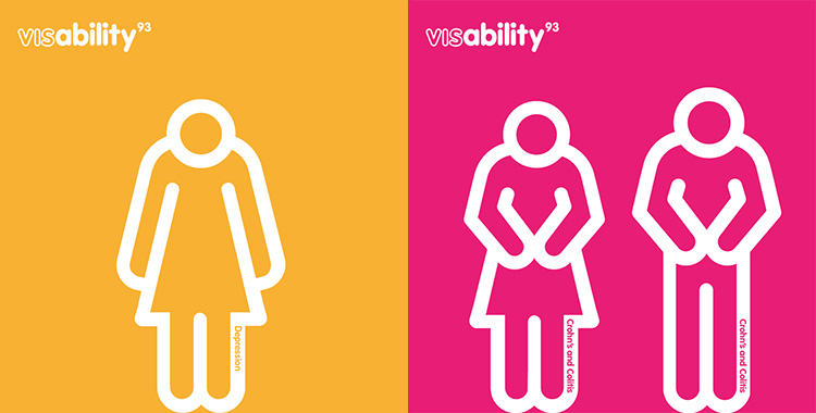
As the ISA – a white figure in a wheelchair against a blue background – celebrates its 50th anniversary this year, McCann London has launched its Visibility93 campaign to address the sign’s relevance in today’s context.
Over the past 50 years, advances in science and people’s perceptions have led to us as a society slowly recognising that a person in a wheelchair is not necessarily indicative of someone with a disability. From physical disabilities like arthritis to mental ones such as schizophrenia, ‘invisible’ disabilities can often be overlooked and suitable access denied. The Visibility93 campaign was launched by McCann to shed light on this and to reimagine the sign as one that is more inclusive.
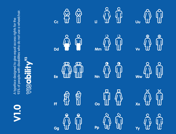
The Visability93 campaign includes a suite of custom typeface that can be freely downloaded from the campaign website, as can a free poster, to raise awareness of the same.
Why the number 93? According to Sport England, 93% of the people living with disabilities do not in fact use a wheelchair. McCann wanted to draw focus to this eye-opening statistic.
The original disability sign, designed by Danish student Susanne Koefoed in 1968 played a huge role in raising awareness and promoting empathy, acceptance and a change in perception. But even the best of designs must take heed of the zeitgeist and readapt itself to become meaningful and relevant in its current context.
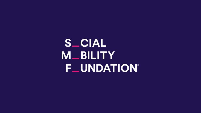
Making Growth Fun – Social Mobility Foundation
The Social Mobility Foundation in England, is a charity that works towards improving the lives of young people from low income and minority sections of society, by helping them gain an entry into good universities and on to the career paths of their choice.
Jones Knowles Ritchie (JKR), which worked on the project for free, has rebranded the organisation to be more in tune with the target audience – a young, Internet savvy, always-online community. The new identity is playful and inclusive.
Keeping in mind that online platforms are a big marketing channel for the organisation, JKR developed animated branding, which you can see below – it’s playful, attractive, clever and representative of upward mobility. The missing ‘o’ concept was extended to promotional and marketing material.
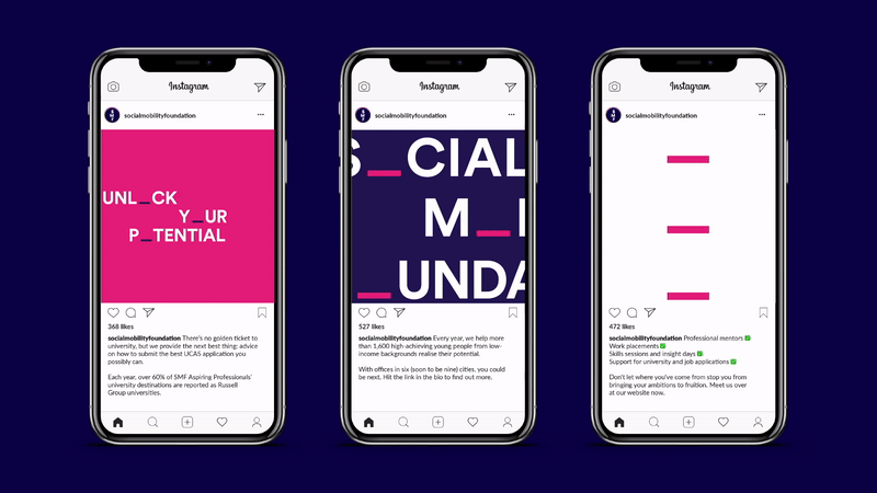
The firm was also cleverly able to transfer the missing ‘o’ concept into static print material, such as posters, brochures and t-shirts.
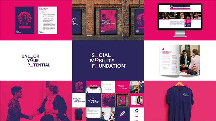
While developing the redesign, JKR worked within certain constraints. For example, it didn’t alter the existing identity to an extent that it would no longer be recognisable as that of the organisation’s. It made subtle tweaks instead, such as retaining the original colour palette of pink, purple and white, but opting for slightly brighter shades. It also kept in mind that running costs across brand extensions should be kept to a minimum to make it a viable proposition for the charity. So a free typeface that is readily available on Apple and Microsoft systems was chosen, while existing photographs from the charity’s own vast database were used for impactful imagery.
Depicting the Role of Women in 2018 – Girl Guides, UK
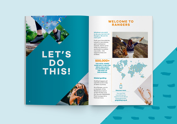
The role of women in today’s society is vastly different from what it was a 109 years ago, when the concept of Girlguiding was born. For over 100 years, the organisation has been encouraging girls and women between the ages of 15 to 25 to “learn new skills, work as part of a team or as a leader, and complete projects for social or charitable causes.” The Guides are split into 4 categories based on age (plus the Senior section for those aged 14 to 25). Guides can earn accomplishment badges in a skill or an area of interest by completing certain (age appropriate) challenges. The brand’s redesign which was developed by Red Studio, focused on a new look and feel for the badges and the corresponding award books and handbooks. It also incorporates the addition of new skills to the Guides’ repertoire, such as Coding, Inventing, Human Rights and Festival Go-ing.
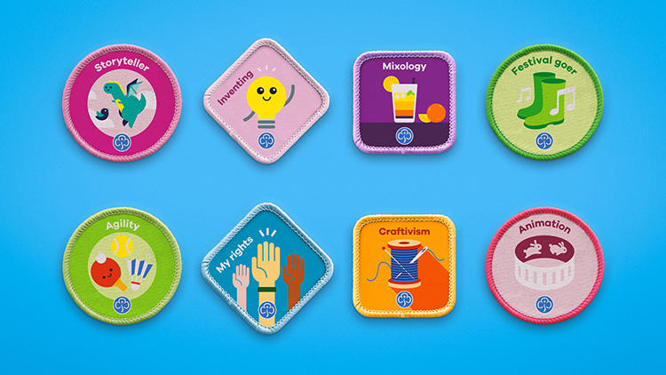
The badges are current, appealing and appropriate to all the Guide age groups. One of the main outcomes of this re-design is that the new badges have a more “permanent” feel to them – they can be sewn onto jackets, caps, blankets etc. as keepsakes, evoking the feelings of achievement and belonging, as well as nostalgia in the years to come.
While the colour palette for for all the age groups is the same, the books for the two younger groups focus more on the colours and contain illustrations; the use of colour in the books for the two older groups is more pared down and photographs instead of illustrations are used.
The examples highlighted here have added value to existing designs by making them relevant to their current audience, in their current context, without taking away from the core of what each brand has stood for over many years.
Design Thinking focuses on human-centered design that truly adds value to the end user. Do you have a brand identity that needs re-imagining for today’s world? Using the framework of Design Thinking, Zeitgeist can help you design and develop a Brand Strategy that can take your business to the next level. Reach out today!
Gitanjali Singh Cherian
Marketing Manager
Image and information source: www.designweek.co.uk