Your address will show here +12 34 56 78
Brand Strategy

Ferrari was just ranked as the world’s strongest brand (not to be confused with the world’s most valuable brand, which is Amazon) in Brand Finance’s annual report on the world’s most valuable brands.

While several factors make up a strong brand, today we’ll focus on one element – the role a brand promise plays in building a strong brand. A brand promise has been defined in various ways, but in essence it is what a brand commits to deliver, every single time, via every interaction with the brand.

So which brands have got it right? Let’s take a look at 3 examples:


FERRARI

Ferrari has always been clear about why they do what they do. Their mission states “We build cars, symbols of Italian excellence the world over, and we do so to win on both road and track. Unique creations that fuel the Prancing Horse legend and generate a “World of Dreams and Emotions.”
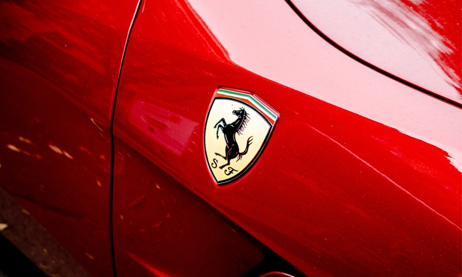


The clarity they have on why the company exists, is translated into all that they do, be it developing the latest technology to win in Formula One racing, incorporating the sleekest designs and ultimate driving pleasure into their customised on-road cars or ensuring an unparalleled exhilarating experience when one visits the Ferrari Museum at Maranello.

With every brand interaction the customer experiences uncompromised excellence. It is the reason millions of motorsports enthusiasts who will never drive a Ferrari feel emotionally connected to the brand.


NIKE

Nike’s mission is “bringing inspiration and innovation to every athlete in the world” with the annotation “if you have a body, you’re an athlete”

Nike’s messaging through its ad campaigns has always focused on attitude, rather than a person’s ability or achievements. Most of their ads feature ordinary people, who are fuelled by a passion to ‘Just Do It’; the message is to overcome laziness and obstacles and reach for the stars.

The two ads below, one from 1988 and one from 2017 are excellent examples of how the company has stayed true to its brand promise over the years:


NIKE advertisement, 1988


NIKE advertisement, 2017


Nike stays true to its brand promise (bringing inspiration and innovation) through its messaging, as well as through the innovative technology it incorporates into its products and experiences associated with them. Whether it’s the recently launched Nike Adapt BB , its Flyleather technology or the company’s first Nike House of Innovation at Shanghai , the company continuously delivers cutting edge innovation.


COCA COLA

How is it that a carbonated drink that contains undesirable amounts of sugar ranks amongst the world’s 10 strongest brands? It is in huge part because of consistent brand messaging that ties back to a clear brand promise. Coke’s brand promise, “To inspire moments of optimism and uplift”, is all about bringing family and friends together, sharing and happiness.

The company has shifted the focus away from the product itself and moved it to the brand, staying consistent in its messaging over the years. 1971 saw the iconic ‘I’d Like To Buy The World A Coke’ ad, which featured a cast from over 20 countries and portrayed the drink as “not only a refresher but a way to connect with people you love, people that have the same taste for Coca-Cola.” It also touched upon diversity.


Read about the interesting story behind this ad campaign here


Nearly 50 years later, the Share a Coke campaign sticks to the same brand promise, but has moved with the times and is more relevant to today’s youth, the brand’s main target market.


KEY TAKEAWAYS

1. Simply defining a brand promise isn’t enough. A brand must be able to deliver on that promise – every single time. Companies that fail to do so run the risk of there being a misalignment between the user’s expectations and what they actually get, eventually leading to the weakening of the brand.

2. A brand promise should serve as a guiding star for everyone working in an organisation, helping them to understand their role in achieving a bigger purpose.

3. A brand promise, whether explicitly stated or subtly incorporated into a company’s products, services and interactions, gives the customer clarity on what to expect from a company and what makes that company different from other players. It is the reason McDonald’s – a fast food chain considered unhealthy by many – has a market in Paris, one of the best ‘food cities’ in the world! It may not be the healthiest food, it may not be the ‘tastiest’ food, but you know exactly what to expect from the brand in any of their outlets in any part of the world. The brand promise is consistently delivered through every interaction, building customer loyalty. It is the reason McDonald’s ranks No. 5 on Brand Finance’s Top 10 Strongest Brands of 2019.


Does your brand have a brand promise? Zeitgeist can help you discover it. Reach out to us for help with your Brand Strategy.


0

Brand Strategy

Here’s a new word people are warming up to in the graphic design industry – Stylescapes – and this blog is going to talk about how they are used as part of our branding process at Zeitgeist.


Clients often don’t know how to respond when attacked with a board full of pictures and random alphabets, aka Moodboards; mostly because they’re not sure how to read or interpret them. But it is still crucial to go through this step because it lays the foundation stone for the logo.


Enter saviour: Stylescapes!


These are just nuanced, more ‘finished’ versions of the above. It makes it much easier for the client to visualise and choose the future of their brand and saves a lot of avoidable back and forth time.


This step provides a good check-in point for both parties to agree on two things:

1. If the designers have clearly understood the client’s description of their concept.

2. The design direction the client is choosing to head with.


Decoding The Board

Stylescapes are made huge in size to scale up the ‘real-feel’ of the brand.


They list out the brand promise, the brand pillars, typeface and fonts, the colour palette. They also contain sample photographs of different users of the product/service. Elements of brand language such as textures, grids, photography style, illustration style, web and print mockups etc. Depending on their process, some designers also choose to put in initial logo iterations as well.


The key to choosing the right design direction is by picking a stylescape that hits the ‘feel’ of your brand just right. That being said, remember, the elements on the board are always up for play and further refinement.

It is far more efficient to tweak a stylescape in the right direction than redo a logo headed in the wrong direction!


Here is an example to understand what a styleboard looks like and how a design brief can be given different visual takes. Different typography, colours, photographs and adjectives have been used here to create 3 separate brand identities ranging from conservative to bold.


‘Cue’ is a brand designed by Blind with Hudson Pacific Properties.


0

Brand Strategy, Business Tips & How To's, Design Strategy, Space Design

At Zeitgeist, we design experiences for people.


The best way to do this we feel, is to design a space keeping its “soul” in mind.


For a private project, this “soul” may be reflective of an individual’s (or group’s) aspirations, personality or achievements. For a commercial project, it should be reflective of the venture’s brand. In both cases the experience is designed keeping the end user in mind.


The best opportunity to do this arises when a concept is born, but its personality (brand) has not yet been developed.


One of the instances where Zeitgeist had the opportunity to develop a brand and then give it life via a space and brand extensions was when a client presented us with their idea of developing an authentic Italian pizzeria in Whitefield, Bangalore.


Understanding The Personality

The project proposed by the client was for their flagship restaurant, which they had plans to expand into a chain in the future. Upon immersing ourselves into a Brand Development Workshop with the client, it was clear that their USP was to be an authentic Italian pizzeria.


As part of the Brand Audit process, we conducted in depth research into our target market – expatriates – using Focus Groups as our methodology for this particular project. We chose this method, since we were given a very clearly defined market segment. (You can read more about the relevance of Focus Groups in the brand development process in an earlier article of ours.)


From this we understood that the target market would respond well to a homely “mamas and papas” pizzeria – the kind you’d find in a quaint alley in Naples.


Further expanding on what our research revealed, we used the framework of design thinking to design the entire experience for the end user.


Once we were clear on the brand’s personality and had ensured that it represented a match between the client’s vision and the market’s desires and expectations, we set about the Brand Development process, beginning with ideating for names, logo direction, fonts and colour palettes we thought would work.


Now that the Brand Language we needed to develop was clear, we also began to work on integrating it into the design of the space.


The proposed site for the pizzeria was an abandoned 8000 sq. ft. industrial warehouse that had previously been used to manufacture aeronautical parts.


Speaking the Language

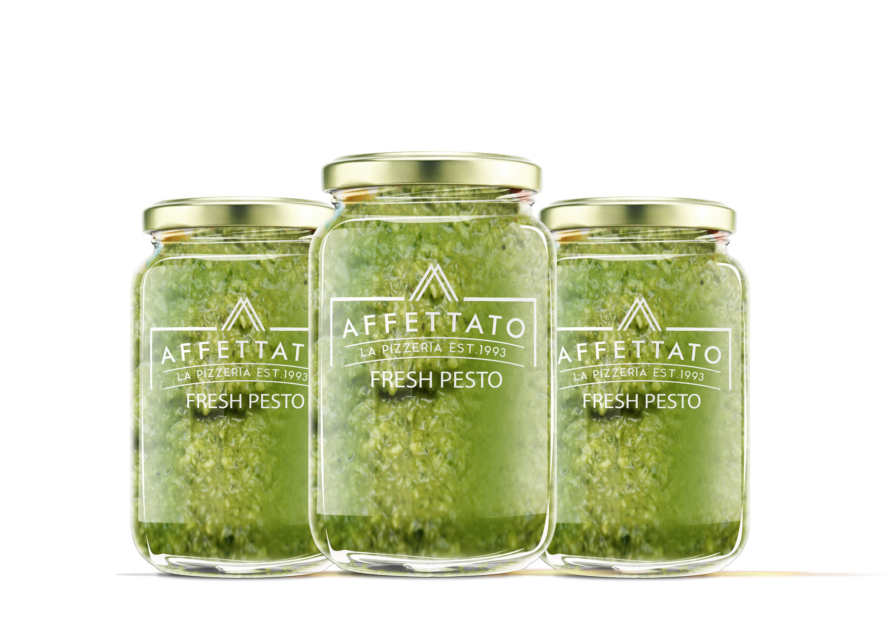
The finalised Brand Name, Affettato – Italian for “sliced”, represents authenticity, while alluding directly to the product.


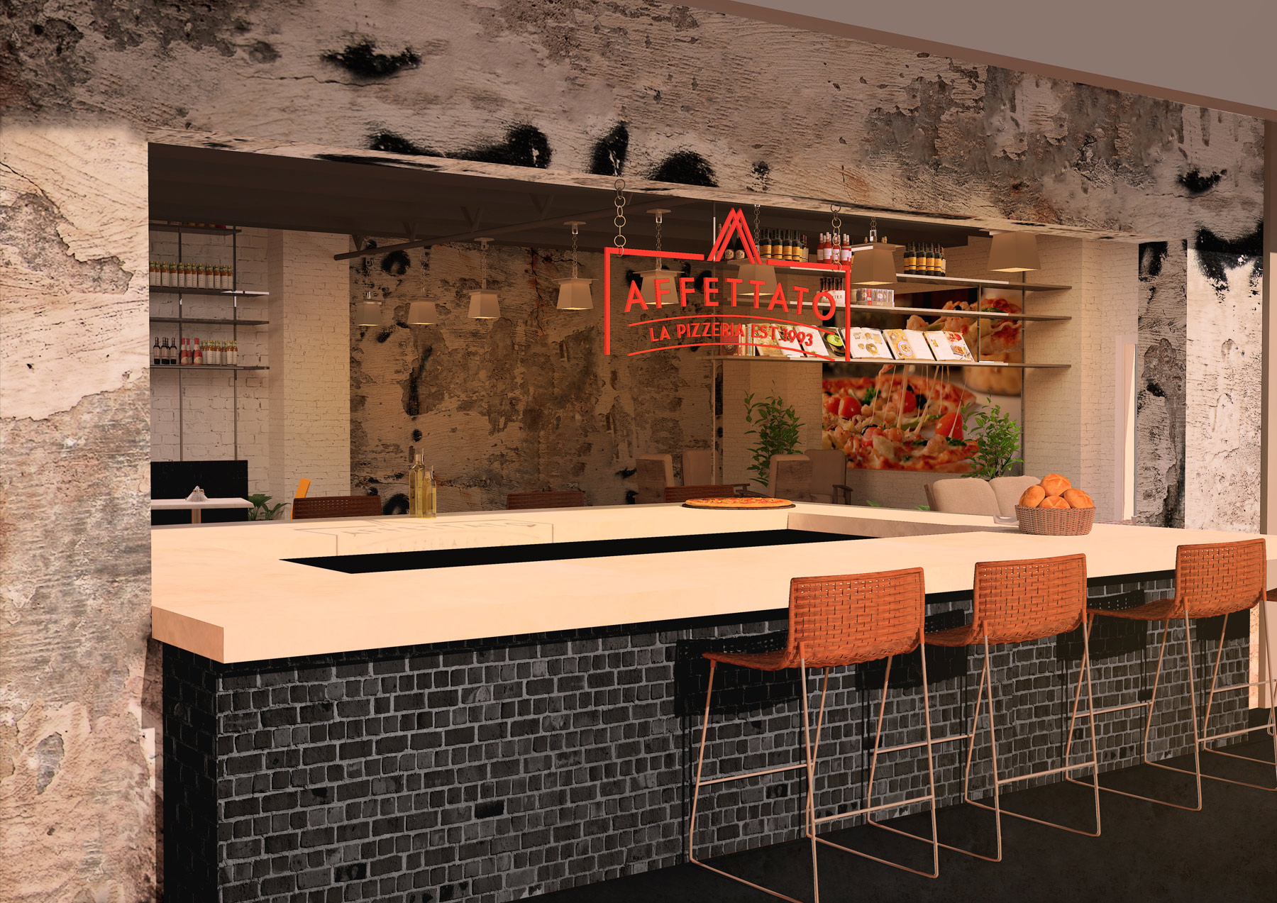
Staying true to being authentic, we proposed retaining the feel of the old warehouse and developed a Space Design that would tie in nicely with the Industrial look trending across the globe. The idea was to give the customer the feeling that he could be at a trendy, hip restaurant in any part of the world.


Nothing says ‘authentic’ like inviting a customer into the process, and so we developed a plan wherein the kitchen wall would be conceptualised as the window to good Italian street food. In the same vein, we also designed a large, open pizza bar, allowing for a seamless transition between the indoor and outdoor spaces, while simultaneously working this idea into the design of the logo as well.


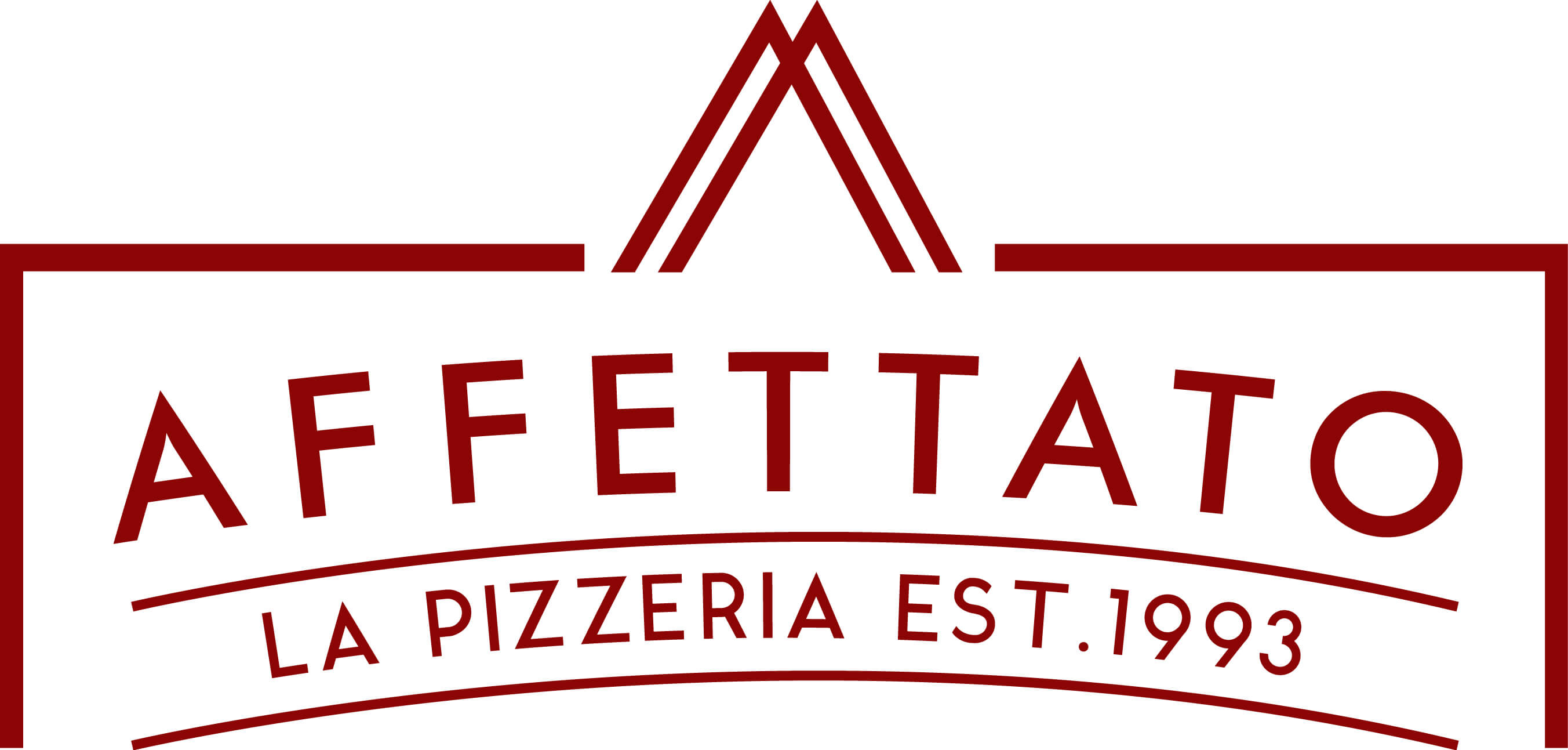
The Logo is framed by a large cutout, just like the bar – open and authentic; the triangles represent slices of pizza, while the sans serif font is in harmony with the trendy, industrial vibe of the brand and space.


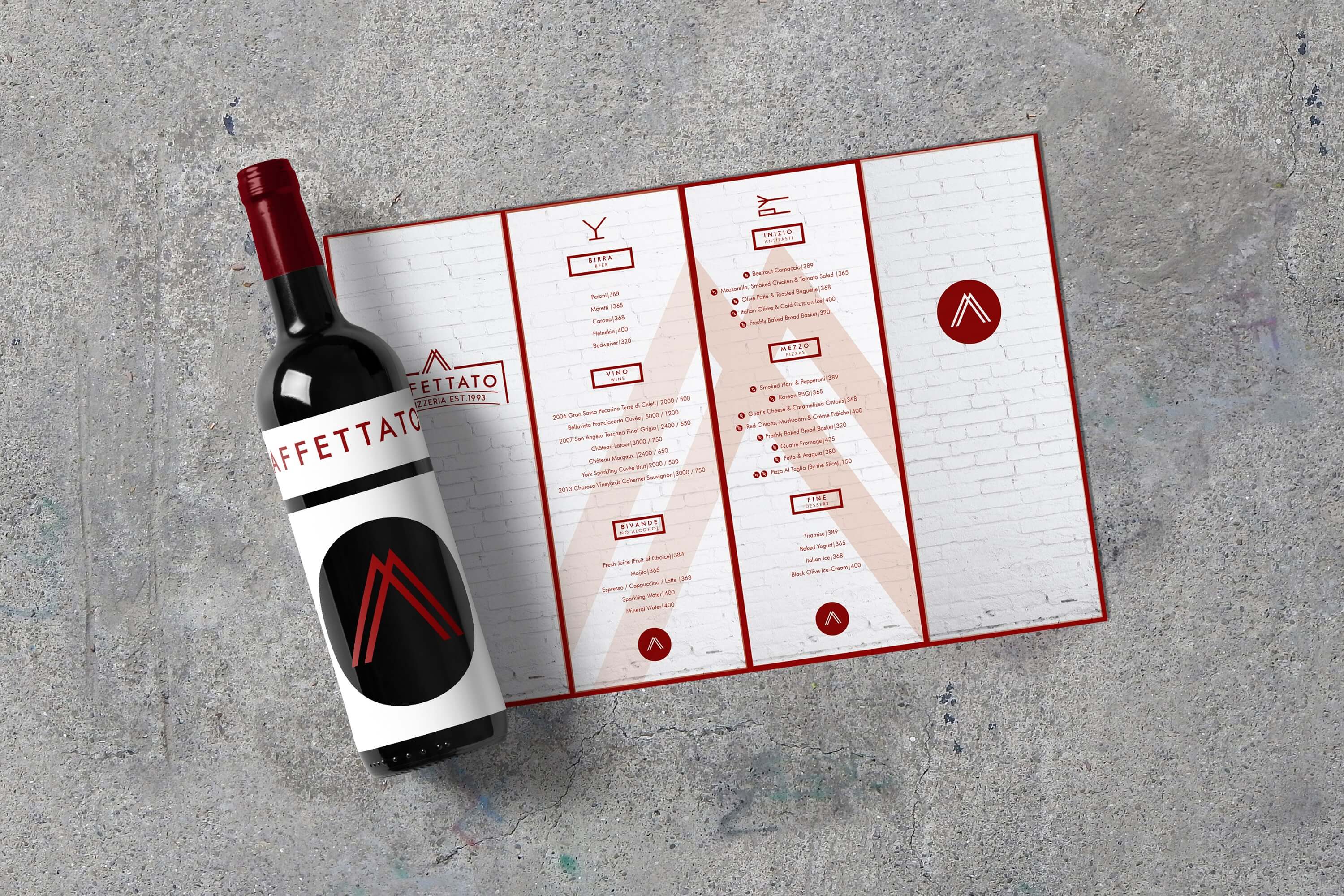
Finally, we set about extending the brand language to the Brand Collateral – including the menu and branded merchandise like pasta sauce and wine bottles.


Tying It All Together

The benefit of interweaving the brand development process with the design of a space, is that it puts us in the advantageous position of first understanding the market we are designing for.


Once we understand the end user it becomes easier to design a brand and a space that speak to each other and to the end user, and does not end up being a disjointed, unsatisfactory experience – something that benefits neither the end user nor our client.


Do you have an innovative idea or a new venture just about to take off? Using the framework of design thinking, Zeitgeist can help you develop your brand’s personality, give it a unique voice and translate it into an experience of value to your customer.


Get in touch today.


0

Brand Strategy

A brand is not just its logo. It is an identity; a personality. A ‘brand’ is what makes a consumer your customer. It is an experience that needs to be designed. But how does a design agency take it all the way there?


Imagine a really complex game of Pictionary mixed with Taboo… I think that would be a good way to describe the process that takes place between a designer and a client while developing a brand.


START AT THE BEGINNING

One of the first things designers need to do while developing a brand is to understand their client’s vision – by asking questions.


How well a designer is able to assimilate their client’s vision lies in their ability to ask well-crafted questions and to be a good listener.


With reference to the comparison drawn before, a client meeting could sometimes be that part of the game where all the right words you want them to say are taboo. The only way you can guess is by drawing them out for your client and the only way they can respond is with more non-taboo words!


That can get irksome.


So, here are some ideas on how to ask questions while developing a brand’s identity. The Internet of course is everyone’s resource-base, but this article will help you make those questions smarter and more tactful. 


TIPS ON FRAMING THE RIGHT QUESTIONS

1. Human beings are storytelling creatures. We are drawn to memorable personal narratives, which always makes it a good idea to start with your client’s story. How was their business born? What motivated or inspired them?


This will give you a real insight into their earnestness for their project. It will also open your client’s heart to trusting your process and sharing with you uninhibitedly, throughout.


2. Not every client may have exemplary imaginativeness; therefore it is up to your questionnaire to give them the platform to communicate their thoughts effectively.

Situation questions are the most fun, brilliant way of doing this. Here are some question examples:

   –  Do your customers belong to certain a age/demographic?

   –  How would you describe these people?

   –  Where are they consuming your product?

   –  SIf you were to overhear someone describe your brand to another person, what do you imagine they’d be saying?

   –  In what setting did you picture these two people talking?

   –  What words do you never want associated with your brand?

   –  Situation questions are the most fun, brilliant way of doing this. Here are some question examples:

   –  If you had to choose an actor/actress to play the character of your brand, who would it be? Why?

   –  Imagine your brand were a period in time; what would it be and why?


3. Questionnaires can sometimes sound like exams that incite a feeling to answer ‘correctly’— and that’s not very useful. This typically happens in a casual conversation: ‘But don’t you think…’ or ‘You want it to look… right?’ To reiterate, asking leading questions is a bad idea.


4. But on the other hand, do keep in mind the subtle difference between leading and clarifying questions. The latter is a good practice when reinforcing important points spoken about earlier. So make sure you establish the intent of your asking.


5. While it is valuable to ask for preferences in colour or motifs and such, make sure to ask your client to not get too fixated on them. Since the actual making of the logo happens much later in the process, a designer wouldn’t want to feel restrained by things like colours.


6. Be conscious of what you assume. If your client owns a business for progressive farming techniques, they may or may not want to use the colour green or have a leaf in their logo. It’s good practice to always crosscheck.


7. It is important to know when it’s pertinent to use either an open-ended or a close-ended question. Here’s a personal example: I’d asked, ‘Do you have any thoughts for your company tagline?’ and all I got was a flat ‘No’. It might have been more helpful for me to have put it this way: ‘What feelings would you like your company tagline to provoke in a customer?’ and then followed by ‘Do you have any existing ideas for one?’


8. A section of the questionnaire should just be devoted to juicing out adjectives and as many descriptive phrases as possible. Sitting together and jotting down an expansive pool of words that can be ascribed to the brand is a remarkable exercise for getting those creative juices flowing!


9. One might not always feel the same passion they felt when they were first struck with their idea. Hence, asking your client to answer your questionnaire in a certain setting can be a great way to bring that feeling of passion back to them!

You could suggest an isolated cubicle in their busy office or answering it right after they’ve come back from a vegetable store (for example, if their business is about organic greens).

To make things more stimulating, you could conduct your interview in the place where the client first came up with their idea or any environment where they feel most zealous about their brainchild.


10. Finally, leave scope for things you might not have been able to predict you wanted: ‘Is there anything else that came to your mind while answering this questionnaire?’ is a great way to end.


Remember, the right answer might just be the right question away!


Pahi Gangwar
Graphic Designer


0

Brand Strategy

In the same way placing a Ferrari logo on an old, beat up car doesn’t make the car a Ferrari, branding is much more than just designing a brand’s logo or developing it’s name. Here’s what a sound brand strategy can do for your business:


1. CREATE A LEADER – Brand Consultancy


Brand Consultancy addresses the value your brand has to offer to the market.


Developing a sound strategy begins with a brand development workshop. This tool helps identify the why, the how and the what your business has to offer the market. Drawing out and rooting your business to the newly defined pillars that the company will stand on forms the basis for any further communication development.


In a Brand Audit the effectiveness of your brand is understood – what is your brand’s current position in the market? What are its weaknesses or inconsistencies? How does it compare to its competitors? What is its place in the market


2. DEVELOP A KEY DIFFERENTIATOR – Brand Identity


Brand Identity and Brand Recognition follow from a sound market assessment.


What are your competitors doing? How do they look, feel and communicate? How can you be different?

How can your brand be positioned to really attract your target market?

Ub

Developing a sound Logo, Brand Extensions and Collaterals such as stationery, merchandise and packaging, play a huge role in differentiating the brand from its competition. What is the message your brand is sending its audience? And how can that voice stand out from all the others?


3. ACQUIRE YOUR MARKET – Brand Communication


A good Brand Communication Strategy is vital to engaging the brand’s target market. This is where your brand starts to become a personality.


Rooting back to its pillars, the brand begins to develop a voice that reaches the ears of its target market, by developing sound strategies for Social Media Reach, Website Development, Marketing Collaterals, Campaigns and Product Launches.


Is your brand’s promise coming through? Is your communication strategy sound enough for your audience? Can the market trust you?


Does your brand need assistance in any of these areas? Zeitgeist can help – reach out to us.


0

Brand Strategy

Have you ever wondered why some brands appeal to you right from their logo through to all their viewable content across channels?

It’s because you understand the language. And just like alphabets make words that are the building blocks of English , a moodboard creates anchors to visual language that make a brand.

And as we all know, a brand is NOT just a logo.


The Beginnings Of A Strong Brand

So you have an idea – an outstanding business plan that makes sense to execute in today’s market. And you feel the excitement of sharing this with EVERYBODY. And then you stop short. How are you going to communicate this perfect little brain child of yours?

Always begin with a moodboard.

Allow yourself to explore images, patterns, colors, typography, illustrations and textures that inspire you to develop your business. If you believe your business has a fresh and innovative offering, look for elements that will continue to inspire that feeling. This becomes your base point for development. Zeitgeist uses Pinterest as a tool to gather these ingredients – something that would be hugely beneficial to a rookie too.


Identifying The Communication Process

Depending on how creative the Client is, we choose to either create a tangible mood board for interaction, or a digital mood board to confirm direction. Based on your resources and preferences you can do the same. I personally prefer a board that I can touch, to drive the senses even deeper.

Then, begin to arrange your elements to make sense visually. Perhaps you decided to club categories together, perhaps you prefer to jumble things into what works for you mentally. The idea is to get you to start feeling like your business is being rooted into something visually communicative for your target market. If you feel the board is getting too heavy, it’s okay to remove a few elements, or if you feel right about it, split them into two, to analyse two potential directions. There is no wrong or right. This is just conceptual.

Now you have your anchor. As you develop your brand remember to keep looking back at your moodboard to draw continually from those elements that inspired you to begin with. If you stay rooted to the same colors, typography and imagery, you will begin to see your Brand speaking its own language to your potential market.


From Design Brief To Mood Board

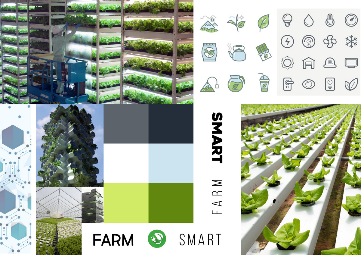
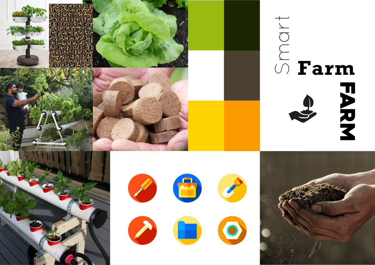
Today Zeitegist shares two digital mood boards with distinct directions, based around the design brief for SmartFarm, that nudged the Client into choosing a clear road map going forward.

Hope this helps! Happy Designing 🙂


The Design Brief

SmartFarm represents a marriage between agriculture and technology.

The brand language should be ‘Young’, ‘Fun’, ‘Relevant’ and ‘Flexible’.

The brand identity needs to appeal to both, B2B and B2C market segments.


INSPIRATION 1
The mood board that follows brings together a collection of images, colours, patterns and art that render an uncompromising, more corporate but approachable feel to the brand language:


INSPIRATION 2
This collection of images, colors, patterns and art brings a more congenial and sophisticated yet friendly feel to the brand:


Madhuri Rao,
Founder & Chief,
Design Strategy


1

Brand Strategy

Just like the human body, a well thought out brand has multiple parts that function together to make the whole. So, what are those parts, and how do we apply it to our process?

When a Dubai based client approached us with her idea for the e-commerce fashion brand she wanted to launch, we went to work to dissect her brand into key elements that would serve as a clear differentiator in an overwhelmingly competitive market.
The idea was to humanise the brand with a clear and distinct personality that added value to the local market.


THE SOUL

We started with its SOUL. Why did this brand need to exist? What was its core purpose? Its vision? To get these answers Zeitgeist immersed the client into an in depth 2-day brand development workshop to spring some life into the business. It very quickly became evident that this e-commerce platform was to be the canvas that connected fashion enthusiasts to unique products from all over the world.


THE BRAIN

But what would this mean to the BRAIN of the brand? We needed to figure out a logical way that this brand would reach its market. We understood that Fashion Harbour’s largest market would be women and so right from its name, we needed to inspire, excite and welcome in our target market. To do this we needed to dig deep into all the areas these women interacted with that were connected to fashion and lifestyle. We wanted to build logical strategic alliances that could help deliver our message. And so, we began to build Fashion Harbour’s roadmap to reach its destination.


THE HEART

Now we needed to infuse HEART into Fashion Harbour. How could we manifest a feeling of warmth and togetherness to create a sense of loyalty? Heavily embedded in R&D, we understood that to communicate our brand we would need distinct social media strategies put in place. To begin a relationship that inspired loyalty meant that we needed to figure out what inspired these ladies. We understood that a large part of our market spent hours browsing Instagram looking for brands and products that could add value to their lives. And this is where Fashion Harbour needed to be. We spent countless hours on design strategy. How should each post look? How will it sound? What do each of these women want to hear? The idea was to allow the brand to invoke loyalty from its customers. We created online strategies that mitigated loneliness, created self-worth, offered education and induced community.


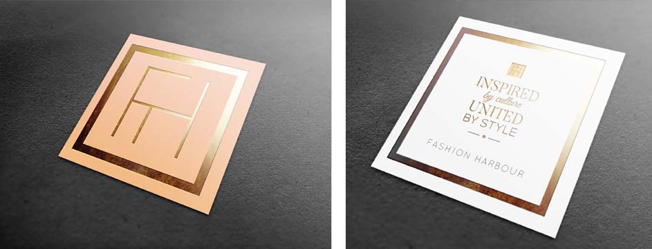
How did this all come together to form the DNA of the Brand? Very simply, the brand’s unique value proposition was to be ‘Inspired by Culture, United by Style’. This meant that everything the brand stood for and communicated would represent expressive fashion, global fashion & democratic fashion.
We developed the brand to represent a lifestyle, and not just a collection of products.


DRESSING IT ALL UP

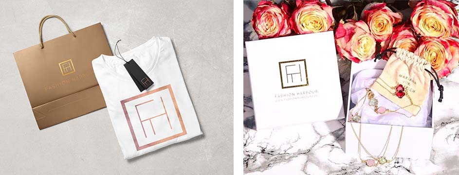
What CLOTHES would the brand wear? What would be in its cupboard? The brand identity needed to be gentle and feminine but strong enough to advocate its presence online. We drew inspiration from the local pier to define the typeface and created a fluid watercolour as the background to emphasize femininity in the logo. Colours and gradients were used to depict varied forms of fashion and culture that all talked of the brand’s DNA – open minded and inspired. And ultimately, our logo was designed as the brand’s favourite hat – a distinguished, impactful image that was tailored to remind the user of a trendy brand that impacts their life.


Madhuri Rao
Founder & Chief,
Design Strategy


0