
Brand Strategy, Design Strategy
Human beings are built on connections. Think about how many connections the human body alone has!. And then think about how human beings cannot survive alone. We are built on methods of communication – within and without; millions and millions of them. And without them we wouldn’t be able to process anything.
Now think about food. What does it really take for us to wholly enjoy the process of eating food? Once again, millions of connections. But where do these connections start?
For us it began with Sanctuary Architects reaching out to us to collaborate on developing the Brand for a restaurant they were designing for a top notch Client. This came to us as a pleasant surprise. Weaving brands and spaces was home to Zeitgeist, but now we had the opportunity to showcase our talent alongside Anshul Chodha, principal at Sanctuary – and this was more than appetizing!
Digestion is the process of breaking down food for the body to use as nourishment – this is not far removed from the process of collaboration, for healthy design.
THE EYES – The Visual Appetizer
Have you ever heard of the saying ‘we eat with our eyes’? Perhaps you are starving, perhaps you’re not; but your eyes are the first impulse driver for you to want to devour good food. For a designer, the same can be said of well crafted design.
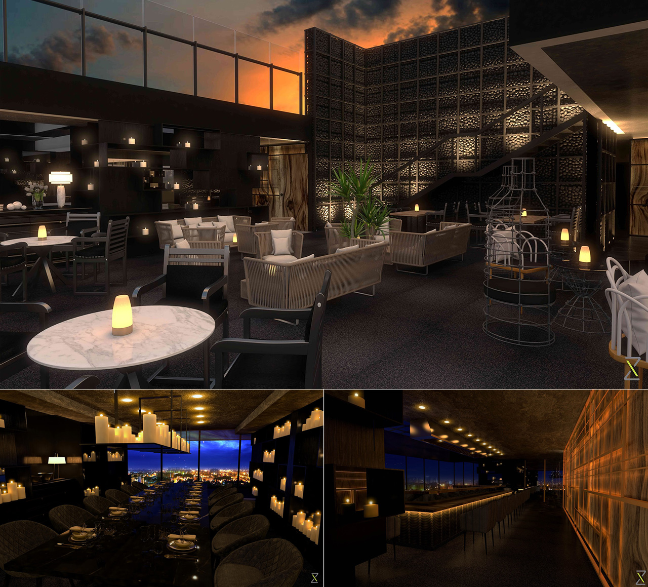
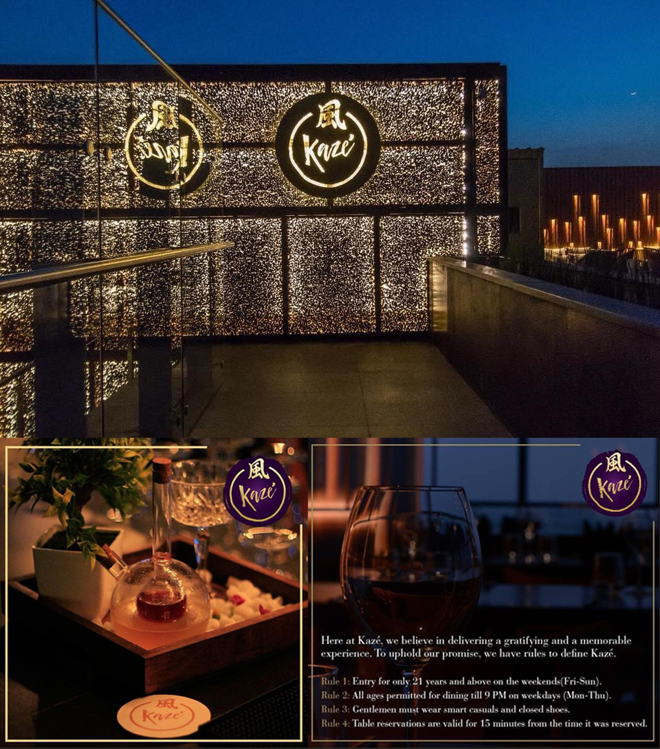
On a massive floor plate sitting atop one of Bangalore’s most prestigious buildings, Anshul’s design direction for the restaurant was reflective of the expansive cityscape that lay ahead. Magically lit gabion walls exuded strength in connection, and his well conceived travelling walls spoke of a global Pan-Asian story. Though it is usually the other way around, the space lay the foundation for Zeitgeist to visualize the brand at break-neck speed. It set the direction for the Brand’s name and visual identity. It also helped us immensely as we created photorealistic renders as imagery for the final output for the space. There was so much to absorb, just with our eyes.
THE MOUTH – The Provocative Main
Did you know that way before food even enters your mouth, its aromas create a saliva producing reaction to enable the breaking down of it upon entry? The chewing then takes care of the rest. This too is the tale of powerful design collaboration before market entry. Just like the body’s preemptive intelligence to break down food, design intelligence comes from multiple communication exercises and touchpoints through the design process, before its final output.
As Sanctuary began to weave design language to invite the market into a powerful spatial experience, Zeitgeist worked toward expressing the brand to reflect the importance of it. What were the languages, expressions and words we could use to express the combination of this luxurious business and its spectacular design direction?
Multiple conversations with the Client brought us to the point where we understood that the brand name needed to be simple enough to pronounce in a multicultural context, without losing its positioning in the market. As we ingested more and more information about the Client and the collaborative process that lay before us we began to lay out structured steps to arrive at an integrated solution for the Client and our Design Collaborators.
THE STOMACH – The Sweet Satiation
The stomach does two things:
1. It acts as a holding station for food
2. It also facilitates the breakdown of food for the body to absorb nutrients
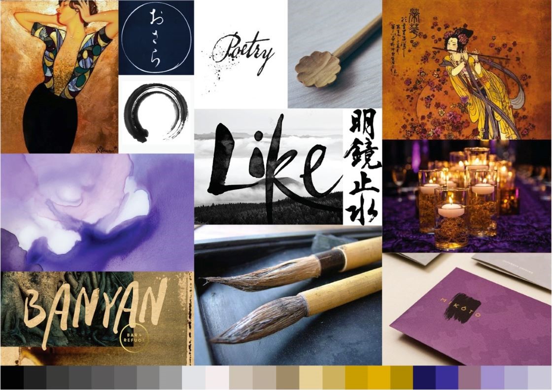
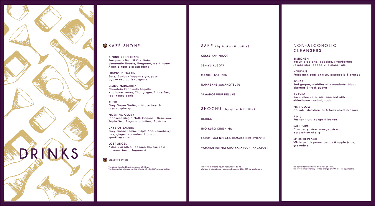
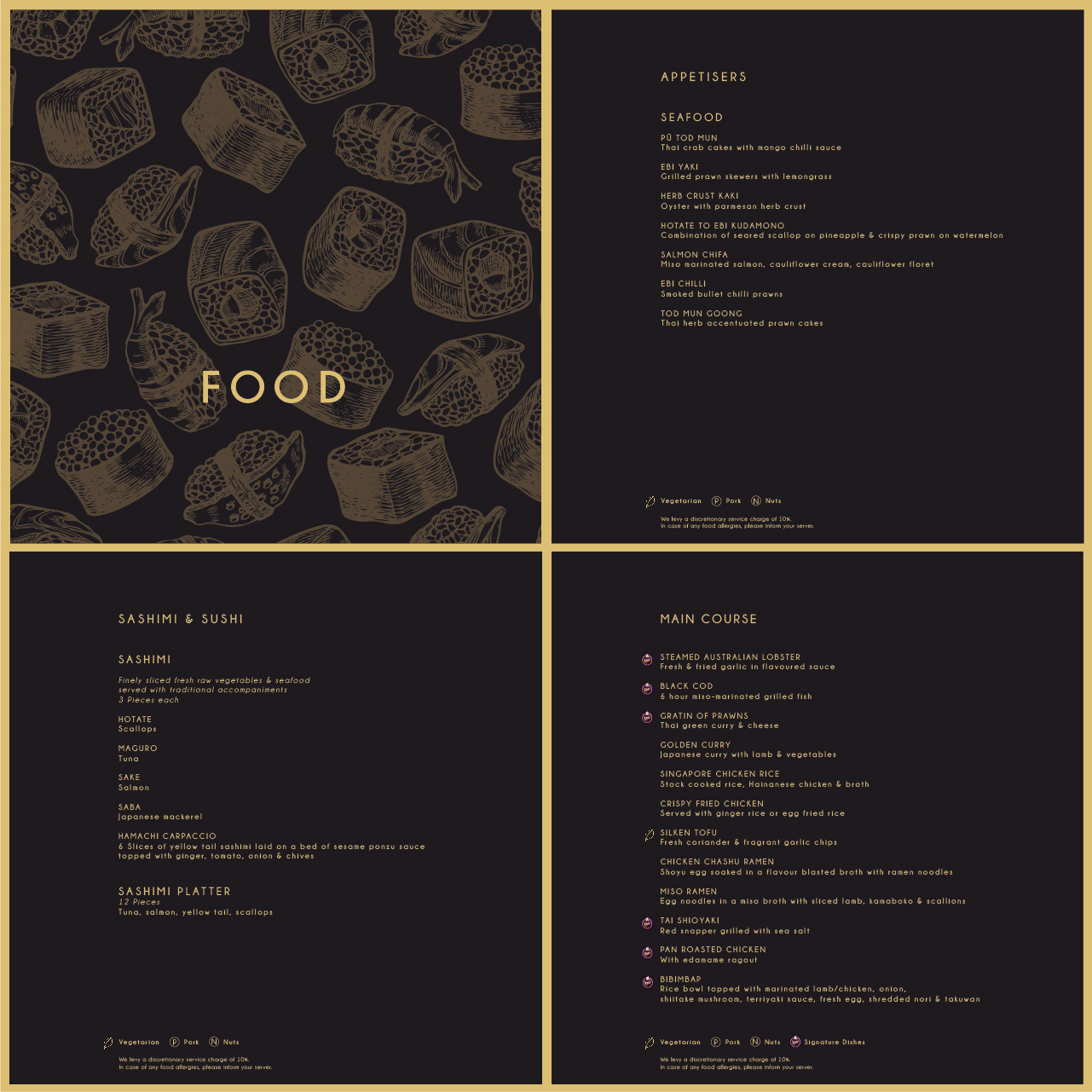
In the same way, Sanctuary created a holding station for the Client and we drove the nutritional breakdown of its offerings. The interiors express urban Pan-Asian luxury through its use of materials and large expansive openings. The interesting and carefully designed seating nudges a sense of grandeur, while the well defined spaces offer privacy based on mood and function. The brand’s design and development aimed to tie the interior expression into the Client’s vision for the business – an upmarket, luxury pan-asian restaurant. Together with the Client, Zeitgeist decided on the name Kaze – meaning ‘wind’ in Japanese – and developed its visual identity with airbrushed swirls of purple and gold to evoke the feeling of royalty, gently moving in the breeze. The menus were adapted along the same color palette, with added graphics to distinguish the bar menu from the food menu, and content was reorganized to enhance user-friendliness.
Just like the body processes food, together we imagined an experience that would be enjoyable to digest – one built on cohesion, collaboration and connection.
Madhuri Rao
Founder & Chief – Design Strategy