
Brand Strategy, Design Strategy, Trends
The end of the year is always a good time to take a look at trends that dominated the year gone by. While 2018 has been an exciting year in graphic design, 2019 promises to be even more so, with new technology and digital platforms opening up possibilities like never before. It also poses the question of what new skills graphic designers will have to hone to keep up in the coming years.
In the last article for this calendar year, Zeitgeist shares 5 of its favourite graphic design trends of the year and throws light on what we feel will be big in 2019. Creativity only gets better with shared ideas, so do share your thoughts in the comments below and reach out to us for collaboration. We’re waiting to hear from you!
What Was Big in 2018?
EXPERIMENTAL TYPOGRAPHY
While experimenting with typography is not new to the graphic design world, 2018 saw several design agencies take things to the next level, with cropped typography, chaotic typography and negative space typography dominating much of the scene.
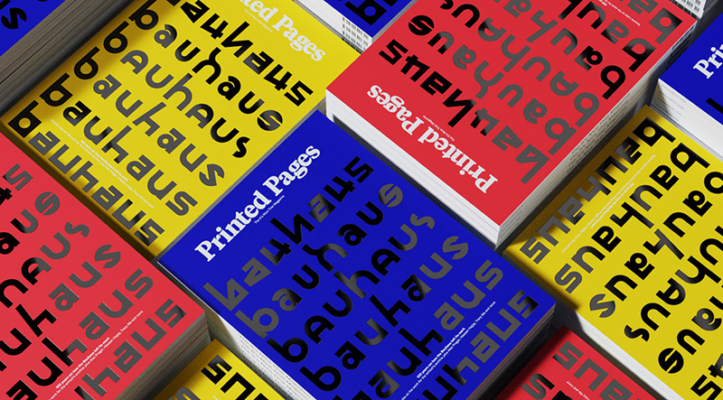
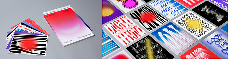
While designing the identity for the Bauhaus Archiv, the team at Pentagram has created no less than nearly 600 glyphs! This image shows a mere 42 of them, used on the cover of Printed Pages’ AW18 edition (also designed by Pentagram) which celebrates 100 years of Bauhaus and is available in 3 vibrant colours.
In fact, a visit to Pentagram’s Instagram account reveals that using interesting typography has been a big trend with the firm throughout 2018. They’ve used it in their work for the London Design Festival 2018, the September 2018 cover of Poetry Magazine, Droit and the Institute of Contemporary Arts/Boston to name just a few examples.
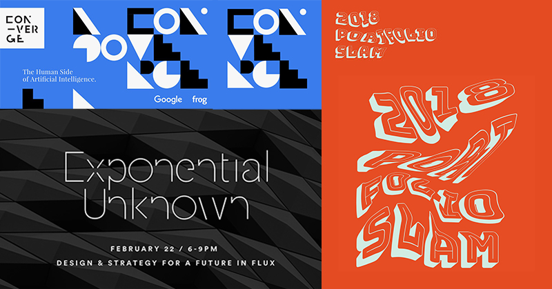
The trend was also popular at Frog:
COMPLEX GRADIENTS
If 2018 is anything to go by, using gradients in graphic design, a trend made popular by iTunes way back in 2015, isn’t going anywhere. If anything, designers are taking things up a notch by experimenting with more complex versions, such as radial gradients and multi-starting-point gradients, resulting in mesmerising visuals.
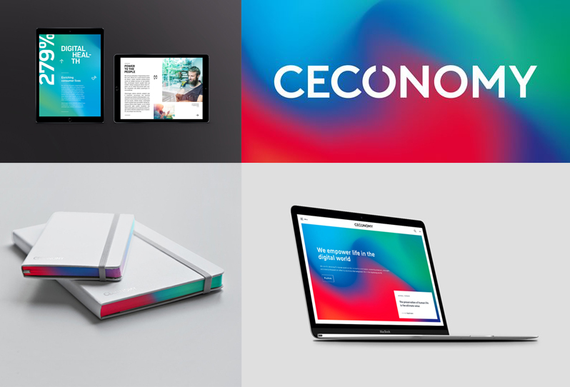
Landor used it in their rebranding of Ceconomy, creating vibrant, attractive visuals across various collateral.
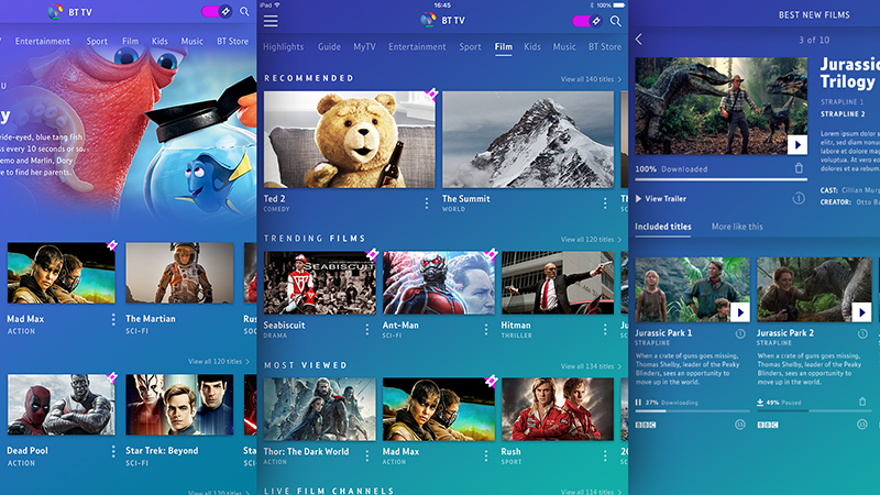
Frog’s redesign of the TV experience for British Telecom subscribers saw the use of gradients as well:
Sagmeister and Walsh on the other hand, combined not one, but three cool trends, using gradients, trippy typography and duotones in their work for Zumtobel lights.
DYNAMIC DUOTONES
Using duotones is a great way for brands to incorporate a brand language across their collateral spectrum. Made popular by Spotify a few years ago, 2018 saw other brands create their own versions that make their brand immediately recognisable.
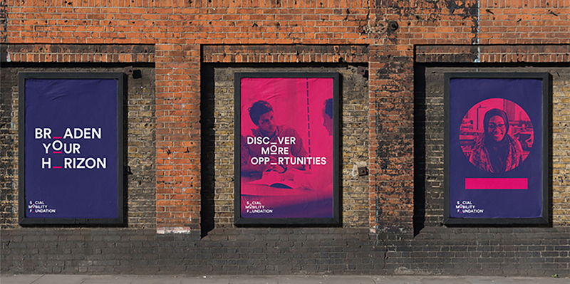
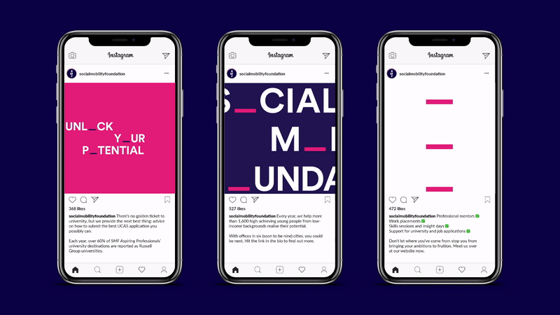
Jones Knowles Ritchie really upped the ante on brand recognition and the ‘cool’ factor with their 2018 rebrand for the Social Mobility Foundation, by using striking duotone filters in their work, and also incorporated a clever moving ‘O’ into the logo.
Pentagram’s work for the Atlantic Theatre Company’s 2018-19 campaign also features duotones and gradients, creating an immediate association with the brand.
IMAGINATIVE ILLUSTRATION
While 2017 had its fair share of customised illustrations across brand campaigns, including one of our personal favourites – the AMVBBDO commissioned Mariana Rodrigues’ illustrations for Bombay Sapphire’s campaign featuring the 10 sustainable ingredients they use to make their gin, 2018 saw a continuation of the trend, with big names from the New York Times to Slack using the work of illustrators to give their brands unique one of a kind visuals and stand out amongst the competition.
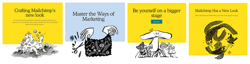
Mailchimp’s 2018 rebrand as an anti-tech company by Collins and R/GA, featured the work of a series of illustrators, resulting in the new bright and catchy, mainly yellow, black and white graphics.
Evernote’s 2018 rebrand by DesignStudio also saw eye-catching graphic illustrations that built on the original vibrant green of the brand’s logo.
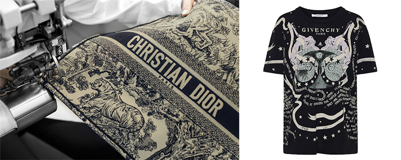
The trend even found its way to fashion houses, with both Givenchy and Dior using illustrations in their Zodiac series and Toile de Jouy Dior book tote designs respectively.
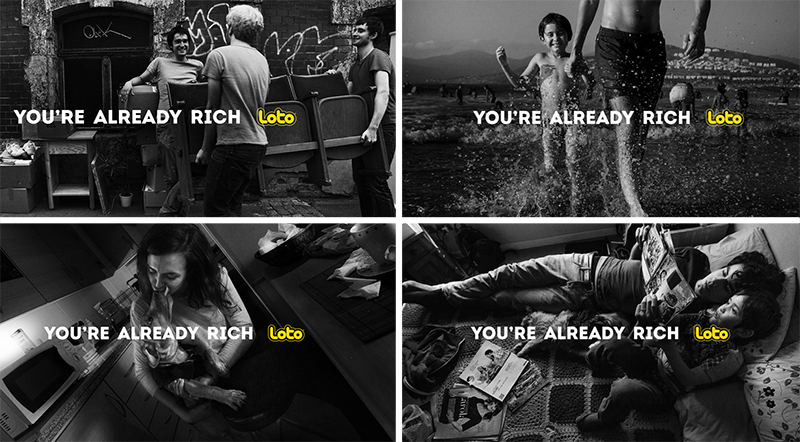
AUTHENTIC PHOTOGRAPHY
Brands have been paying more attention than ever before to the fact that today’s consumers greatly value authenticity. One of the ways this has filtered through to graphic design is by using authentic photography in design. This works particularly well when sending a strong message through a campaign, such as in the Social Mobility Foundation’s imagery (see above) and the You’re Already Rich campaign by Young & Rubicam, Santiago for Loto.
2019 and Beyond: What’s in Store?
FUTURISTIC DESIGN
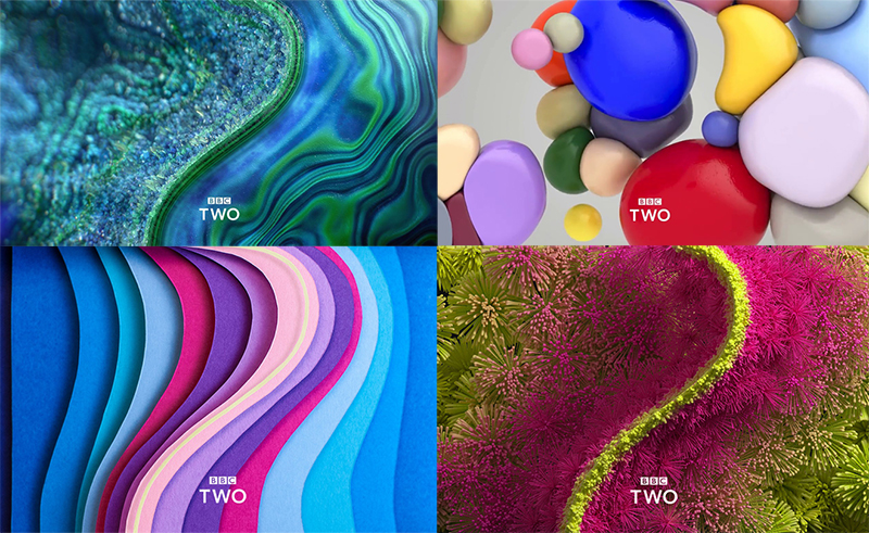
Global trends in technology, innovation and social changes directly influence graphic design and advertising trends. Zeitgeist feels that 2019 will bring a lot more futuristic looking designs, in keeping with the way our world in general is moving – think IoT, blockchain technology, AR, VR, and MR – and using graphics that look like they’re out of a Star Wars movie feels like a perfect fit. BBC 2’s recent rebrand – its first in 20 years – is one of the best examples of this upcoming trend for the new year.
MOVEMENT IN GRAPHICS
Graphics that incorporate movement is another big way graphic design is heading. Visit the Ceconomy website and you’re greeted with a swirly background inviting you to read their quarterly statement – it draws you right in! The same goes for graphics used by brands on Instagram and other forms of social media. Vogue Magazine released its first ever digital cover on Instagram, featuring a sparkling, red Vogue logo.
As already mentioned, the Social Mobility Foundation also saw movement in its rebrand:
FUTURE READY
Nearly all the examples we explored are ‘future ready’, designed not only for print, but also for all forms of digital media and the next generation of technology. For example, the Pentagram designed Printed Pages cover artwork mentioned above comes to life when viewed with the Artivive app.
INCLUSIVITY
Zeitgeist also predicts that graphic design will become more inclusive in 2019. What does this mean? Think Section 377, the #MeToo and equal pay movements that gained traction across the world this year. As society begins to take a stand against inequality and discrimination, it is bound to be reflected in the brand communications, so whether it’s using authentic photography, imaginative typography or designing in a futuristic context or one that is more inclusive of the disabled, graphic design will begin to reflect this trend too. We end this article with a great example of this – McCann’s work with MGM Resorts – reimagined love songs for the LGBTQ community, entitled Universal Love.